Chapt 2- Data Presentation
- Qualitative data
- Quantitative data
- Summarising data using graphs
- Graphs presented in misleading ways
- Summarising data numerically
- Distribution

Data presentation
Data can be binary, nominal, ordered, discrete quantitative, or continuous quantitative.
Graphs include bar-charts, pie-charts, histograms, box-and-whisker plots and scatter diagrams. The type of graph used should be chosen according to the type of data being displayed. Be aware that graphs may be presented in misleading ways. Furthermore, graphs can be symmetrical, positively skewed or negatively skewed.
Types of average include the mean, median, and mode. Measures of spread include the range, interquartile range, variance, and standard deviation. Means and measures of spread should be chosen according to the type of data being summarised and some measures are susceptible to outliers.
Qualitative data may be binary , nominal , or ordered .
Qualitative variables have no numerical significance (e.g. we cannot add up or multiply together any values that are assigned to the categories). Qualitative data can be binary, nominal or ordered.
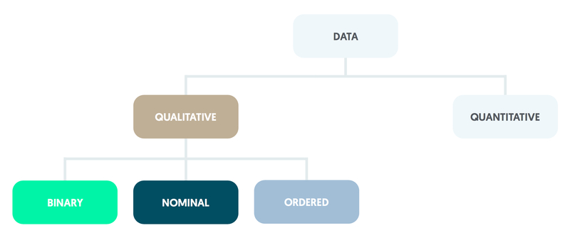
Binary variables, such as whether or not someone arriving at an A&E department is admitted to a ward, have only two categories.
Nominal variables have several categories (e.g. type of scan: CT, MRI, or PET). Any figures attached to the categories (such as CT = 1, MRI = 2, PET = 3) have no numerical meaning.
Ordered (or ordinal) variables also have several categories but these can be ranked or ordered using numbers (e.g. health: very poor = 1, poor = 2, intermediate = 3, good = 4, very good = 5).
An individual categorised as having good health is less well than one whose health is rated as very good, but is in better health than someone who has a health rating of intermediate. Note that differences between categories (such as 4 - 3 or 3 – 2 in the example above) do not have a meaningful numerical interpretation.
Quantitative data can be counted or measured .
Quantitative variables take measured values, which may be further divided into discrete or continuous variables.
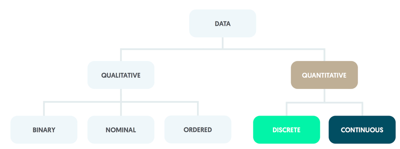
Those consisting of whole numbers only are described as discrete quantitative.
An example is the number of visits that a patient makes to an outpatient clinic during a calendar year.
Quantitative variables may be continuous and can take values that are constrained only by the accuracy of measurement.
For instance, blood glucose level is usually stated in mmol/L to one decimal place with a normal individual typically having a value of approximately 5.5. Differences between quantitative values are numerically meaningful; two patients differ between themselves by precisely one outpatient visit per year whether their values are 2 and 1 or 12 and 11 (say).
Graphs display data and should be chosen according to the type of data being presented .
Commonly used graphs include bar- and pie-charts, histograms, box-and-whisker plots and scatter diagrams. Graphs can be symmetrical, positively skewed or negatively skewed. Be aware that graphs may be presented in misleading ways.
A bar-chart can be used for nominal data, ordered data or, if there are only a few categories, whole numbers.
The bars should be spaced apart, with each height being proportional to the category’s percentage out of the total number of observations.
Pie-charts operate in a similar manner but use sectors within a circle; the angle of each sector is proportional to the category’s percentage out of the total number of observations.
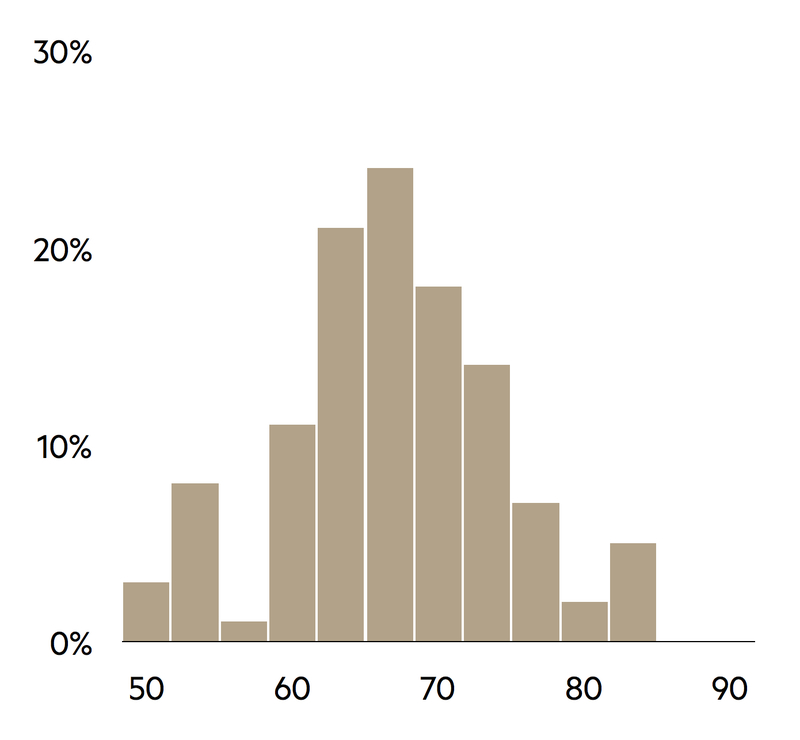
With quantitative data, histograms should be used rather than bar-charts. Bars should not have gaps between them as each represents an interval for the variable under consideration.
The histogram is constructed using the number of observations in each interval. It is good practice to use intervals of equal width, as the height of each bar is then proportional to the category’s percentage out of the total number of observations.
The number of intervals to be used should be considered carefully. Too few intervals may prevent important features of the distribution from being identified, whereas too many lead to a distribution with a jagged rather than a smooth shape.
In practice, the number of intervals that should be used is constrained by the size of the sample; a common guideline is that the number of intervals (x) should be roughly equal to the square root (√) of the sample size (n) (e.g. x = √n). Given that a histogram needs at least five bars to be helpful, it is recommended that there should be a minimum of 30 observations.
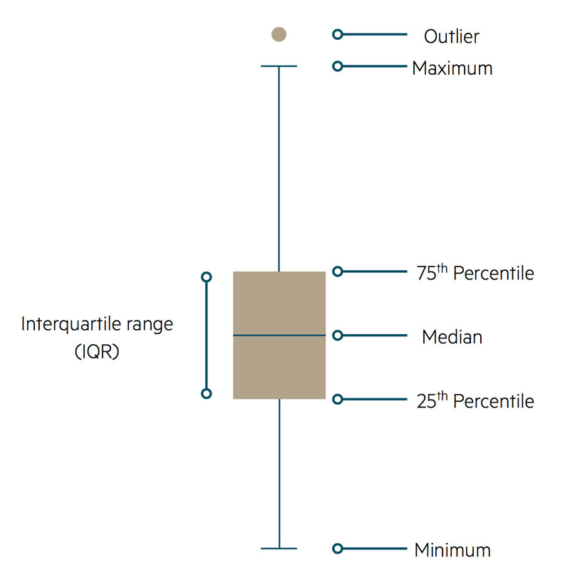
Box-and-whisker plot
An alternative type of graph suitable for continuous quantitative data is the box-and-whisker plot. Values are plotted against the vertical axis.
The main features of a box-and-whisker diagram are based around a line that is parallel to the vertical axis of the graph. Around the centre of the plot there is a rectangle that is divided into two by a horizontal line. This middle line corresponds to the median value of the variable, with the upper and lower horizontal sides of the rectangle representing the upper and lower quartiles of the distribution respectively (these three quantities are defined below).
Vertical whiskers extend from the horizontal edges of the rectangle in both directions; these represent the range of other non-extreme values. Any extreme values, known as outliers, are shown as small circles beyond the limits of the whiskers. Unfortunately, there is no convention as to what constitutes an outlier so a subjective decision may be required.
Comparing groups
The methods described above can be extended to contrast two or more groups within a sample. For example, the size of mechanical valves implanted in heart surgery can be compared for male and female patients by constructing two bar-charts.
If two continuous variables are being compared, such as height and weight, a scatter diagram can be drawn using a two-dimensional plot.
Scatter diagram
During child development, weight becomes greater with increasing height. Weight is therefore referred to as the outcome variable, with height being the explanatory variable. In a scatter diagram, the outcome variable (weight) is on the vertical axis and the explanatory variable (height) is on the horizontal axis.
Each member of the sample (each child in a group of young people) can be marked on the scatter diagram with a plotted symbol located using that individual’s height and weight values.
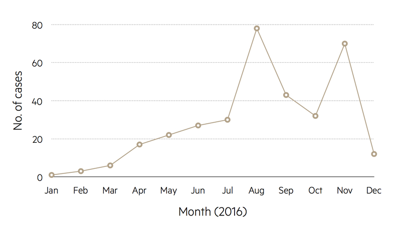
Trends over time can be illustrated as line plots. For instance, the number of cases of measles in the UK for consecutive years can be shown as points with the numbers represented by the vertical axis, the base set at zero, and the years indicated along the horizontal axis. Adjacent points are joined together by straight lines to highlight trends.
It is common to encounter graphs that have been drawn in misleading ways .
For instance, in a graph of trends over time the base of the vertical axis may correspond to a non-zero number in order to give a magnified impression of the size of any changes.
Avoid plotting mean values of groups as bar-charts; this is inappropriate as these charts have been designed for percentages and numbers of observations. In the medical literature, a handle is often attached to the top of each bar in order to give an indication of the variation of the observations within each group, although the way in which the variation has been measured is often not explained.
Using a ploy similar to the non-zero origin that can be found in time trend graphs, bar-charts may be presented with a broken vertical axis. This effectively removes a middle section of the axis in order to inflate differences between the bar heights.
In the media, pie-charts are often given a three-dimensional representation, which is thought to be more eye catching than the traditional circle. However, this method of presentation can create an optical illusion whereby the sectors in the lower region of the resulting ellipse appear magnified and those in the upper region appear contracted.
It is important not only to illustrate data graphically but also to summarise the main features using straightforward arithmetic.
An impression of the size of a typical value from a distribution may be found by calculating an average. There are three main types:
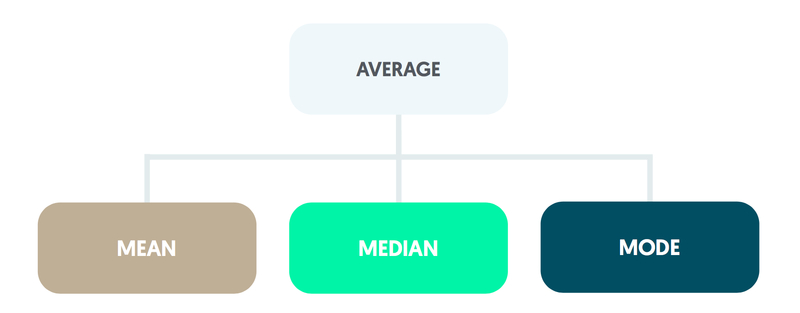
The mean is obtained by summing the values. This total is then divided by the size of the sample.
The median is the middle observation when the values are ordered in terms of size. If the number of observations is even, the mean of the middle pair is calculated.
The mode is found from a frequency count of the values recorded and is the most common value.
Variability
The variability of the observations is summarised using a measure of spread. Methods include the range, the interquartile range, the variance, and the standard deviation.
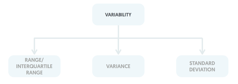
Range & interquartile range
The range is the difference between the largest and smallest values. The interquartile range is the difference between the upper and lower quartiles, where the upper quartile is the value midway between the median and the largest value and the lower quartile is midway between the smallest value and the median.
The variance is found by subtracting the mean from each observation, squaring each of these differences, summing them, and dividing the total by the sample size minus one.
Standard deviation
The standard deviation is calculated as the square root of the variance. Standard deviations are generally preferred to variances as they are in the same units as those of the original observations (for instance, if systolic blood pressure is measured in mm Hg, the standard deviation values will be in mm Hg).
Outliers can have a considerable impact on some types of average and measures of spread.
The mean can be inflated by a single extremely large value, along with the variance and standard deviation. The median and interquartile range are only influenced by outliers if they form a substantial fraction of the whole sample.
By definition, the range is highly susceptible to outliers and it tends to increase as the sample size becomes larger.
The shape of distribution should be checked in terms of the values away from the central region (or the tails of the distribution).
For this introductory discussion it is assumed that the distribution has only one peak. Variables can be symmetrical (as with adult weight in some populations), positively skewed having a few extremely high values and a long tail pointing in the positive direction (e.g. adult alcohol consumption) or negatively skewed by a few extremely low values with a long tail pointing in the negative direction (e.g. length of gestation for live births).
There is an important relationship between the mean, median and the presence or absence of symmetry. For symmetrical distributions the mean and the median are equal. Positively skewed distributions have a mean greater than the median, and negatively skewed distributions have a median greater than the mean.
Other distributions that are encountered include those with more than one peak (e.g. the blood glucose measurements in mmol/L for a mixed group of normal and diabetic individuals) and U-shaped distributions for which observations are less likely to occur in the central portion of the distribution than towards the edges.
Last updated: January 2023
Have comments about these notes? Leave us feedback
Further Study:
Leave feedback
We'd love to hear your feedback on our Data presentation notes.
Pulsenotes uses cookies. By continuing to browse and use this application, you are agreeing to our use of cookies. Find out more here .
Worksheet Solution: Data Handling and Presentation | Maths for Class 6 (Ganita Prakash) - New NCERT PDF Download
| 1 Crore+ students have signed up on EduRev. Have you? |
Fill in the Blanks
Q1: Navya collected data on her classmates' favorite fruits. She found that 8 students liked apples, 12 liked bananas, and 5 liked oranges. The total number of students she surveyed is _______.
Ans: 25 Explanation : The total number is found by adding the number of students who liked each fruit: 8 + 12 + 5 = 25.
Q2: A pictograph uses 1 symbol to represent 5 students. If 4 symbols are used to show the number of students who like chocolate, then _______ students like chocolate.
Ans: 20 Explanation : Multiply the number of symbols (4) by the number each symbol represents (5): 4 × 5 = 20.
Q3: In a bar graph, the bar representing the number of students absent in Class 5 is twice the height of the bar for Class 3. If Class 3 had 4 students absent, then Class 5 had _______ students absent.
Ans: 8 Explanation : Since the bar for Class 5 is twice as high, multiply the number of absent students in Class 3 by 2: 4 × 2 = 8.
Q4: If each tally mark represents 1 vote and 15 tally marks are recorded for a favorite game survey, then the total number of votes is _______.
Ans : 15 Explanation : Each tally mark equals one vote, so the total number of votes equals the number of tally marks.
Q5: The number of symbols in a pictograph must be multiplied by _______ to find the total if each symbol represents more than one unit.
Ans: the scale Explanation : Multiply the number of symbols by the scale to find the total number of units represented.
True or False
Q1: A bar graph can only have vertical bars.
Ans: False Explanation: Bar graphs can have either vertical or horizontal bars, depending on what is being represented.
Q2: In a pictograph, one symbol can represent multiple units.
Ans: True Explanation: A scale in a pictograph allows one symbol to represent multiple units, making it easier to manage larger data.
Q3: The height of a bar in a bar graph does not need to correspond to the frequency it represents.
Ans: False Explanation: The height of a bar in a bar graph must correspond to the frequency to accurately represent the data.
Q4: A pictograph is useful for representing large amounts of data.
Ans: False Explanation: While pictographs are visually appealing, they are not always practical for representing large datasets.
Q5: The scale in a pictograph does not need to be mentioned.
Ans: False Explanation: The scale must be mentioned in a pictograph to clearly show what each symbol represents.
Multiple Choice Questions
Q1: If a pictograph shows 3 symbols for a class that prefers reading and 5 symbols for a class that prefers sports, which class has more students who prefer the activity?
a) Reading b) Sports c) Both are equal d) Cannot be determined Ans: b) Sports Explanation: More symbols represent more students, so the class with 5 symbols (Sports) has more students.
Q2: During a survey on favorite subjects, 6 students chose Math, 10 chose Science, and 4 chose English. Which subject is the least popular?
a) Math b) Science c) English d) All are equally popular Ans: c) English Explanation: English has the least number of students selecting it as their favorite subject.
Q3: A bar graph shows the number of pets owned by students in a class. If one bar reaches up to 10 units and another bar reaches up to 5 units, what can you infer?
a) Both bars represent the same number of pets. b) The second bar represents twice as many pets. c) The first bar represents twice as many pets. d) The first bar represents half as many pets. Ans: c) The first bar represents twice as many pets. Explanation: The first bar is twice as high as the second, indicating it represents twice the number of pets.
Q4: In a pictograph, if each symbol represents 3 books and there are 7 symbols shown, how many books are represented?
a) 10 b) 14 c) 21 d) 24 Ans: c) 21 Explanation: Multiply the number of symbols (7) by the number each symbol represents (3): 7 × 3 = 21.
Q5: A student uses tally marks to record the number of buses passing by in an hour. If she records 4 sets of 5 tally marks each, how many buses did she count?
a) 4 b) 10 c) 15 d) 20 Ans: d) 20 Explanation: Each set of tally marks represents 5 buses, so 4 sets equal 20 buses: 4 × 5 = 20.
| |10 tests |
Top Courses for Class 6
FAQs on Worksheet Solution: Data Handling and Presentation - Maths for Class 6 (Ganita Prakash) - New NCERT
| 1. What is data handling and presentation? |
| 2. Why is data handling important in statistics? |
| 3. What are the different methods of data presentation? |
| 4. How can data be effectively organized for analysis? |
| 5. What are some common mistakes to avoid in data handling and presentation? |
| Last updated |
Worksheet Solution: Data Handling and Presentation | Maths for Class 6 (Ganita Prakash) - New NCERT
Past year papers, semester notes, important questions, mock tests for examination, objective type questions, sample paper, study material, viva questions, extra questions, shortcuts and tricks, previous year questions with solutions, video lectures, practice quizzes.
Worksheet Solution: Data Handling and Presentation Free PDF Download
Importance of worksheet solution: data handling and presentation, worksheet solution: data handling and presentation notes, worksheet solution: data handling and presentation class 6 questions, study worksheet solution: data handling and presentation on the app.
| cation olution |
| Join the 10M+ students on EduRev |
Welcome Back
Create your account for free.

Forgot Password
Unattempted tests, change country, practice & revise.
IMAGES
COMMENTS
Seven (7) of the eight (8) councilors and staff (87.5%) who responded to the questionnaire indicate that women's groups are the most active. Farmers' groups follow this, with five (5) out of the eight (8) respondents (64,5%). This is understandable in that women form the backbone of Beitbridge's rural economy.
PREFACE Welcome to the online book Introduction to Data Science. This book is created to provide a great resource for asynchronous online learning to deal with the current pandemic, where physical lectures are not possible and not all
Data Presentation The purpose of putting results of experiments into graphs, charts and tables is two-fold. First, it is a visual way to look at the data and see what happened and make interpretations. Second, it is usually the best way to show the data to others. Reading lots of numbers in the text puts people to sleep and does little to convey
This chapter deals with presentation of data precisely so that the voluminous data collected could be made usable readily and are easily comprehended. There are generally three forms of presentation of. Textual or Descriptive presentation. Tabular presentation. Diagrammatic presentation. 2.
Data Presentation. Data can be presented in one of the three wa ys: - as text; - in tabular form; or. - in graphical form. Methods of presenta tion must be determined according. to the data ...
Here, the interval width is too large, resulting in only two intervals for our data. With such few intervals it is difficult to identify any patterns in the data. We can get a better idea about what is going on if we choose a smaller interval width - say 5. Doing so gives the following stem and leaf plot: 4.
13.3.2 Tabular Presentation of Data. Tabulation of data may be defined as the logical and systematic organisation of statistical data in rows and columns, designed to simplify the presentation and to facilitate quick comparison. In tabular presentation errors and emissions could be readily detected.
Piazza for all communication. 15-388 vs. 15-688. Two versions of the course: 15-388 (undergrad, 9 unit), 15-688 (graduate, 12 unit) Courses are identical (same lectures, assignments, etc) except that 15-688 problem sets have an additional question per assignment, usually requiring that students implement some advanced technique.
MODULE - 6 Collection and Presentation of Data Notes Presentation and Analysis of Data in Economics 30 making. It is also called statistical data or simply statistics. Data is a plural term. The singular of data is datum. From the meaning we can give some features of the term statistics or data below with example. (i) Statistics are the ...
The Organization and Graphic Presentation of Data—23 A proportion is a relative frequency obtained by dividing the frequency in each category by the total number of cases. To find a proportion (p), divide the frequency (f) in each category by the total number of cases (N):p ¼ f N where f = frequency N = total number of cases Thus, the proportion of foreign born originally from Latin America is
Data visualization is the graphical representation of ... Con: Visual presentation tends to be simple compared to other tools. Matplotlib - Installation ... Multiple PDF/PNG or HTML-based templates; interactivity built-in. Paid version offers: Engagement analytics, team collaboration, consistent product branding. ...
Final project : One team project in which y ou use the data science t ools to answer a data-based r esearch question. It is due on April 28, 2021. Notes : In-class examples and practice problems to make lectures interactive and to provide a better understanding of the R functions. Due one week following the lectur e date.
Datasci 112 is a new course that I developed, based on a course I taught at Cal Poly. This is only the second offering of the course at Stanford. It is now the gateway course for the B.A. and the B.S. in Data Science. This course is designed for freshmen and sophomores who are exploring Data Science as a major, but everyone is welcome!
PDF | On Feb 19, 2020, Teddy Kinyongo published CHAPTER FOUR DATA PRESENTATION, ANALYSIS AND INTERPRETATION 4.0 Introduction | Find, read and cite all the research you need on ResearchGate
the United States. To make sense out of these data, a researcher must organize and summarize the data in some systematic fashion. In this chapter, we review three such methods used by social scientists: (1) the creation of frequency distributions, (2) the construction of bivar - iate tables and (3) the use of graphic presentation.
ix 1: Using Microsoft Excel to Draw GraphsThis appendix explains. how to use Microsoft Excel to draw graphs. Eight steps are involved: entering Microsoft Excel, pr. paring the data, and drawing the graph(s):Stage 1: Start Excel and enter data for Johnso. & Johnson and Merck as shown in Fig. 2.9.Stage 2: Select th.
Statistics. Data Presentations 1. Data presentation: Data presentation refers to the process of organizing, summarizing, and visually representing data in a format that is easy to understand and interpret. Ways of data presentation: We can summarize the raw data in the following ways, a. Classification b.
Graphs display data and should be chosen according to the type of data being presented. Commonly used graphs include bar- and pie-charts, histograms, box-and-whisker plots and scatter diagrams. Graphs can be symmetrical, positively skewed or negatively skewed. Be aware that graphs may be presented in misleading ways.
1 09.02 - 09.08 Introduction to Big Data & Data Science 2 09.09 - 09.15 Overall workflow, Computer Software issues, and applications in the Big Data era 3 09.16 - 09.22 Introduction to R programming 4 09.23 - 09.29 Descriptive & Fundamental Statistics 5 09.30 - 10.06 Understanding Data Structures (Types of random variable) 6 10.07 - 10.13 Data ...
Construct a frequency distribution for the following data Step 3:Find the class width; w=R/k and closest ones (rounding up) w = R=k (3) Step 4:Select the starting observation as lowest class limit (this is usually the lowest observation). Add the width to that observation to get the lower limit of the next class.
Graphic Presentation 27 UNIT 7DIAGRAMMATIC AND GRAPHIC PRESENTATION STRUCTURE 7.0 Objectives 7.1 Introduction 7.2 Importance of Visual Presentation of Data 7.3 Diagrammatic Presentation 7.3.1 Rules for Preparing Diagrams 7.4 Types of Diagrams 7.5 One Dimensional Bar Diagrams 7.5.1 Simple Bar Diagram 7.5.2 Multiple Bar Diagram 7.5.3 Sub-divided ...
Central Tendency measures. They are computed to give a "center" around which the measurements in the data are distributed. Variation or Variability measures. They describe "data spread" or how far away the measurements are from the center. Relative Standing measures. They describe the relative position of specific measurements in the data.
Notes 89 Presentation of Data ECONOMICS MODULE - 3 Introduction to Statistics In the case of vertical bars. States are represented on X axis and number of cars on the Y axis. As per the data given in table 7.4 each bar (rectangle with same base) is raised accordingly to the value of the variable (here the number of cars registered).
Full syllabus notes, lecture and questions for Worksheet Solution: Data Handling and Presentation - Maths for Class 6 (Ganita Prakash) - New NCERT - Class 6 - Plus excerises question with solution to help you revise complete syllabus for Maths for Class 6 (Ganita Prakash) - New NCERT - Best notes, free PDF download