
How to Create an Outstanding Report Presentation!
A report presentation is a daily necessity for most companies. Employees are constantly working on compiling data and facts about their company and department and presenting them in PowerPoint presentations. But often, the presentation design fails to impress.
In this article, you’ll learn how to visualize hard data into an appealing and engaging report presentation for your audience.
What exactly is a report?
A business report is a formal document that communicates corporate information clearly and concisely .
In a report presentation, a company presents data, facts and information, quarterly balance sheets, turnover, HR developments , and so on.
Why report presentations are so important
Report presentations are essential to the success of your business . Why? It’s simple.
Report presentations provide a coherent overview of your company’s performance : What is the current status quo? Which strategic decisions need to be made in the future? How are resources being allocated?
This clear presentation forms the basis for future fact-based decisions . This means it must present facts transparently and answer any business-related questions .
What does a good report presentation look like?
A report presentation has to be clear and concise – after all, you want your audience to understand what you’re saying.
Reporting on data is often very dry. You need to present it in the most visually interesting way possible . An attractive report design will help your audience understand your key messages immediately, without having to delve into specific corporate figures . Keep reading for tips on how to do this.
How to create an engaging report presentation: 5 tips
Report presentations are usually time-limited, so focus on the essential information . The key is to communicate facts clearly and concisely .
Give your information visual interest. Microsoft PowerPoint offers numerous possibilities for enhancing the look of your presentation. Below we have compiled 5 tips for you on how to create an appealing report.
Tip 1: Prepare properly

Preparation lays the foundation for a successful report presentation. Think carefully about how you want to present specific facts and data. Know what you want to say and what your goals are – that’s key for a great report presentation layout. Each slide must have a specific purpose . Only include data that is essential to convey your message .
Give your slides variety but don’t overload them with information or graphics. Less is often more. Try out the unique features of PowerPoint and see which option best suits your presentation.
Focus on the most important key figures and avoid unnecessary details . A good report presentation should make your key statements understandable without your audience having to delve deeper into the company’s key figures.
For 11 helpful tips on preparing your presentations, check out our post, Preparing a PowerPoint Presentation .
Tip 2: Chose the right charts and diagrams
Charts and diagrams are the best way to visualize figures and data. Not only are they visually appealing, but they also summarize your statements in a way that is easy to understand .
PowerPoint offers a wide range of charts and diagrams . You can choose from pie charts, bar charts and area charts, as well as other customizable diagram options. We’ve summarized an overview of the best diagram styles and when to use them in our article, 10 Chart Types: Which One Is Right for My Data?
Some chart types are more suited to specific data . For example, a pie chart is a terrific way to show gender distribution in your company. Bar or column charts can be used to visualize sales, balance sheets and profits.
If you want to illustrate aspects that have happened over a longer period of time, area charts, line charts and of course timelines are ideal.
Feel free to combine several chart types . Let your creativity run free. You can also add icons to your diagrams. The possibilities are endless! Just keep it simple and don’t overload your slides. You can find professionally designed icons in our shop . Take a look at these:
Once you’ve found the right type of chart or diagram, it’s time to highlight the most vital information in it . This helps your audience understand your key messages and quickly identify the most important aspects of your report presentation. If you need to, you can further explain these aspects as you go along.
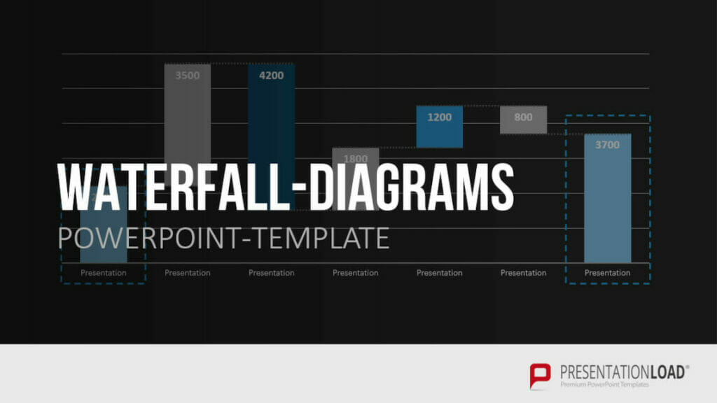
You’ll find professionally designed slide templates for various charts in our shop . For example, this template:
Tip 3: Reuse layouts
Certain topics often reappear in report presentations. A good example of this is quarterly figures or annual financial statements. With these kinds of topics, it makes sense to the invest time in creating an optimal layout that you can reuse .
If you want to compare quarterly figures or annual financial statements, using the same layout makes any differences clear and obvious to your audience.
You can find out how to create your own layouts and other tips & tricks here .
Tip 4: Other design elements
You can also use additional design elements to enhance your report presentation . There are unlimited, creative options to choose from. Think carefully about which elements will visually support your statements.
Try to include transparent images . These are more attractive than normal images and set visual accents when combined with text or graphics. Transparent images are also effective as customized backgrounds, like on title slides. We’ve put together more information on transparent images for you here .
Another design idea is icons . These small images help to break up blocks of text and reduce presentation content to a bare minimum. The simple messages behind icons are universally understood and save space on slides. More information can be found here .
Tip 5: Practice, practice, practice
Ideally, a report presentation should need little accompanying information – your slides should speak for themselves . But that doesn’t mean you don’t need to practice. Especially with diagrams, extra information can further support the infographics. Put particular focus on getting your key messages across.
Think about any questions that your audience may have. Even when your report presentation covers only key content, it’s still important to know and convey more in-depth background information on data, facts and figures in case of follow-up questions .
Of course, there’s so much more that goes into a convincing presentation. Here are some articles with helpful tips:
- 16 Ways to Kick-Start Your Presentation
- Body Language in PPT Presentations: 8 Tips & Tricks
- Rhetoric Skills: How to Speak and Present Effectively
- Presentation Hack: Always Focus on Your Audience’s Needs
- Because First Impressions Aren’t Everything: 20 Tips and Ideas to End Your Presentation in Style
You can find more helpful articles in our blog. ► To the blog
Create expert report presentations
Report presentations are a common part of day-to-day business. With their clear graphic elements, reports communicate unambiguous information that is essential for a company’s success.
No doubt your next report presentation is already in your business calendar. Take our tips to heart and try them in your next report.
Do you have questions about report presentations or general questions about PowerPoint? Feel free to contact us at [email protected] . We’re here to help!
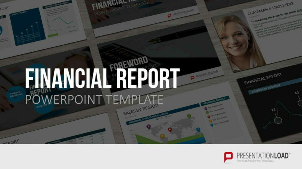
Are you looking for professionally designed slide templates for your report presentation? Take a look around our shop. We have a wide variety of slide templates on numerous (business) topics. You’re sure to find the right slide set for your needs. For example, here’s one for your financial report:
You can find more templates here ► To the shop
These articles might also interest you:
- The Right Way to Use Pie Charts in PowerPoint
- PowerPoint Layout: Tips & Tricks Plus 6 Modern Ideas for Your Slide Layout!
- Make a PowerPoint Image Transparent: The Pro Guide
- Icons: An Amazing Way to Improve Your Content
- Preparing a PowerPoint Presentation: 11 Tips for Guaranteed Success!
- 10 Chart Types: Which One Is Right for My Data?
Share this post
- share
- save
Design Thinking: Problem Solving with a Difference

Why Corporate Mission Statements Are So Important

7 Tips & Learnings from the Apple Keynote
- SUGGESTED TOPICS
- The Magazine
- Newsletters
- Managing Yourself
- Managing Teams
- Work-life Balance
- The Big Idea
- Data & Visuals
- Reading Lists
- Case Selections
- HBR Learning
- Topic Feeds
- Account Settings
- Email Preferences
Present Your Data Like a Pro
- Joel Schwartzberg

Demystify the numbers. Your audience will thank you.
While a good presentation has data, data alone doesn’t guarantee a good presentation. It’s all about how that data is presented. The quickest way to confuse your audience is by sharing too many details at once. The only data points you should share are those that significantly support your point — and ideally, one point per chart. To avoid the debacle of sheepishly translating hard-to-see numbers and labels, rehearse your presentation with colleagues sitting as far away as the actual audience would. While you’ve been working with the same chart for weeks or months, your audience will be exposed to it for mere seconds. Give them the best chance of comprehending your data by using simple, clear, and complete language to identify X and Y axes, pie pieces, bars, and other diagrammatic elements. Try to avoid abbreviations that aren’t obvious, and don’t assume labeled components on one slide will be remembered on subsequent slides. Every valuable chart or pie graph has an “Aha!” zone — a number or range of data that reveals something crucial to your point. Make sure you visually highlight the “Aha!” zone, reinforcing the moment by explaining it to your audience.
With so many ways to spin and distort information these days, a presentation needs to do more than simply share great ideas — it needs to support those ideas with credible data. That’s true whether you’re an executive pitching new business clients, a vendor selling her services, or a CEO making a case for change.
- JS Joel Schwartzberg oversees executive communications for a major national nonprofit, is a professional presentation coach, and is the author of Get to the Point! Sharpen Your Message and Make Your Words Matter and The Language of Leadership: How to Engage and Inspire Your Team . You can find him on LinkedIn and X. TheJoelTruth
Partner Center
👀 Turn any prompt into captivating visuals in seconds with our AI-powered design generator ✨ Try Piktochart AI!
- Piktochart Visual
- Video Editor
- AI Design Generator
- Infographic Maker
- Banner Maker
- Brochure Maker
- Diagram Maker
- Flowchart Maker
- Flyer Maker
- Graph Maker
- Invitation Maker
- Pitch Deck Creator
- Poster Maker
- Presentation Maker
- Report Maker
- Resume Maker
- Social Media Graphic Maker
- Timeline Maker
- Venn Diagram Maker
- Screen Recorder
- Social Media Video Maker
- Video Cropper
- Video to Text Converter
- Video Views Calculator
- AI Brochure Maker
- AI Document Generator
- AI Flyer Generator
- AI Infographic
- AI Instagram Post Generator
- AI Newsletter Generator
- AI Report Generator
- AI Timeline Generator
- For Communications
- For Education
- For eLearning
- For Financial Services
- For Healthcare
- For Human Resources
- For Marketing
- For Nonprofits
- Brochure Templates
- Flyer Templates
- Infographic Templates
- Newsletter Templates
- Presentation Templates
- Resume Templates
- Business Infographics
- Business Proposals
- Education Templates
- Health Posters
- HR Templates
- Sales Presentations
- Community Template
- Explore all free templates on Piktochart
- Course: What is Visual Storytelling?
- The Business Storyteller Podcast
- User Stories
- Video Tutorials
- Need help? Check out our Help Center
- Earn money as a Piktochart Affiliate Partner
- Compare prices and features across Free, Pro, and Enterprise plans.
- For professionals and small teams looking for better brand management.
- For organizations seeking enterprise-grade onboarding, support, and SSO.
- Discounted plan for students, teachers, and education staff.
- Great causes deserve great pricing. Registered nonprofits pay less.
How to Write a Report (2023 Guide & Free Templates)
You have a report due in a few days, but you’re still procrastinating like a pro.
Sounds familiar?
If you’ve been staring at a blank page, wondering how to write a report the best way possible, you’re not alone. For many, writing a report, especially for the first time, can feel like rolling a giant boulder uphill.
The good news is that from a first draft to creating reports that people love to read is a skill you can develop and polish over time.
Whether you’re a student, a professional, or someone who wants to up their report-writing game, keep reading for a 2023 guide and step-by-step instructions on how to write a report. Plus, learn about the basic report format.
You’ll also get access to report templates that you can edit and customize immediately and learn about a tool to make reports online (no need to download software!). You can also jump right into customizing templates by creating a free account .
What is report writing?
Report writing is a way of communicating information, data, insight, or analysis. It’s an essential skill that will come in handy in various settings, from academic research or diving into historical events to business meetings.
But creating a report can be a bit intimidating at first.
In its simplest form, report writing starts with researching and gathering all the information, analyzing your findings, and presenting it in a way that’s easy for your audience to understand.
Sounds easy enough, right?
Well, there’s a bit more to it than that. We’ll guide you through every step of the process to write an entire report from a rough draft and data in the next section.
But first, let’s get to know the different types of reports.
Types of reports
Reports come in all shapes and sizes, and the type of report you write will depend on your specific goals and audience. Each type of report has its unique purpose, format, and style.

The most common types of reports are:
- Academic report – These include school reports, book reports, thesis reports, or analytical reports between two opposing ideas.
- Business report – Business reports range from annual reports to SWOT analyses . The goal of business reports is to communicate ideas, information, or insights in a business setting.
- Research report – Research reports are often more scientific or methodological in nature. They can take the form of case studies or research papers.
Learn more : 20 Types of Reports and When to Use Them (Plus Templates)
How to write a report without feeling overwhelmed
Breaking down the report writing process into three stages can make it much more manageable for you, especially if it’s your first time to create one.
These three stages are:
- Pre-writing stage
- Writing stage
- Post-writing stage
Let’s take a look at the steps for each stage and how to write a good report in 2023 that you can be proud of.
Stage 1: Pre-writing
The pre-writing stage is all about preparation. Take some time to gather your thoughts and organize your main idea. Write a summary first.
Here are important steps to help you deal with the overwhelm of creating an insightful report.
Understand the purpose of your report
Knowing your purpose will help you focus and stay on track throughout the process. Dig into the why of your report through these questions:
- Who is your intended reader? Are you familiar with your audience’s language and how they think?
- What are you trying to achieve with your report? Are you trying to inform, persuade, or recommend a course of action to the reader?
Research your topic
It’s time to gather as much information as you can about your topic. This might involve reading books, articles, and other reports. You might also need to conduct interviews with subject matter experts.
Pro tip on how to write a report : Pick reputable sources like research papers, recently-published books, and case studies by trustworthy authors.
Make a report outline
An outline is a roadmap for your report. It covers your title, introduction, thesis statement, main points, and conclusion. Organizing your thoughts this way will help you keep focus and ensure you cover all the necessary information.
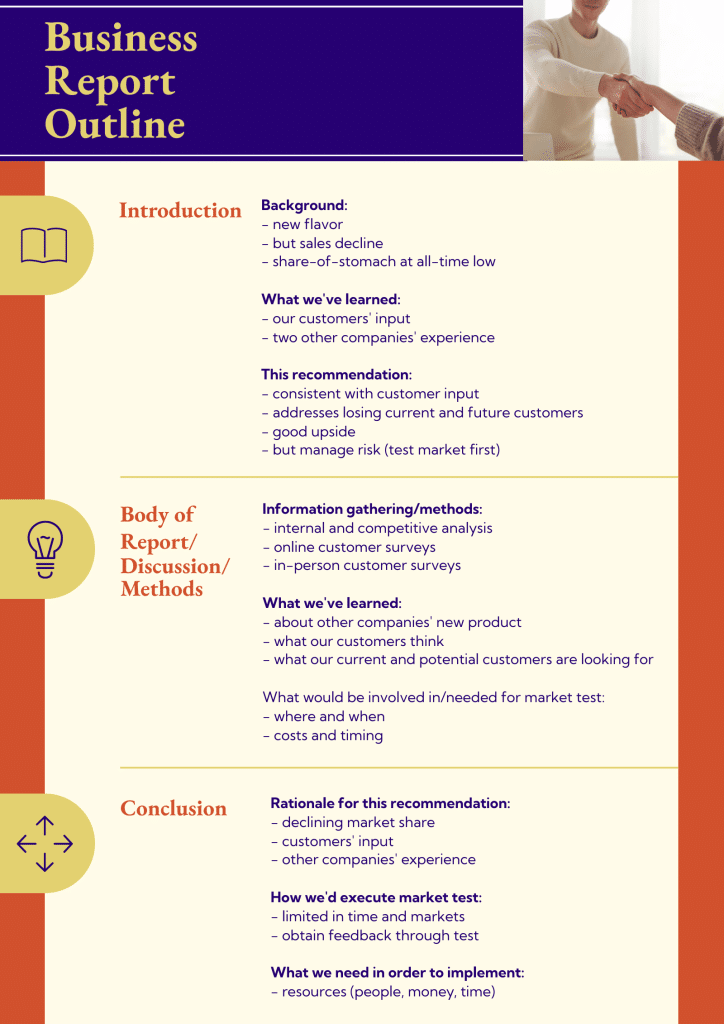
While you can create a report without creating an outline, you could write a better report with an outline. An outline helps you organize your facts and important points on paper.
Stage 2: Writing
Once you have completed the pre-writing stage, it’s time to write your report.
Follow the proper report writing format
You will feel a lot of resistance at this point because this is where most of the tedious work of report writing happens. However, the process can be a breeze if you follow a proper structure and report writing format.
The structure of your report can vary depending on the type of report you’re creating, but the report writing format below can serve as a guide for anyone.
- Title page. This is the first page of your report and should include the report’s title, the author’s name, the date of presentation or submission, and any other relevant information, such as your name or the organization’s name.
- Table of Contents (TOC ). This section contains subsections of your report and their corresponding page numbering. A well-written TOC will help readers navigate your report easily and find the information they need.
- Brief summary . This part provides an overview of the report’s particular purpose, subject, methodology, key findings, and recommendations. This section is often called the executive summary in corporate reports.
- Introduction . The introduction should provide background information about the topic and explain why the report was written. It should also state the aims and objectives of your report and give an overview of the methodology used to gather and analyze the data. Make sure you include a powerful topic sentence.
- Main body. The main body of the report should be divided into subsections, each dealing with a specific aspect of the topic. These sections should be clearly labeled and organized in a logical order. In most reports, this is also the part where you explain and present your findings, analysis, and recommendations.
- Conclusion. Summarize the main points of your report and provide a final summary, thought, or suggestions. Review your thesis statement. The conclusion also includes any limitations of the study and areas for further research or future action.
- References . This section should include a list of all the sources cited in the report, like books, journal articles, websites, and any other sources used to gather information on your subject.
- Appendices . In the appendices section, you should include any additional information relevant to the report but not in the article’s main body. This might consist of raw data, event details, graphs, charts, or tables.
With all these key report elements, your readers can look forward to an informative, well-organized, and easy-to-read report.
Pro tips: Remember to use clear and concise language in your essay. It is also required to follow a specific type of formatting set by your organization or instructor.
Plus, use the active voice when you can because it helps improve clarity. To write a report essay in a passive voice makes it sound less concise.
Reports should usually be written in the third person.
Edit and proofread the article
Once you have completed your first essay draft, take some time to edit and proofread your work. Look for spelling mistakes and grammar errors, as well as any areas where the flow of your article could be improved. Review your topic sentence.
If hiring a professional editor isn’t possible, have a colleague or someone else read your rough draft and provide feedback. You can also use tools like Grammarly and the Hemingway App .
Stage 3: Post-writing
You’re almost there! This stage is about finalizing your report and ensuring it is ready to be shared.
Format your report
Ensure your report is formatted correctly, with clear and easy-to-read fonts, headings, and subheadings.
Incorporate visuals
Adding visuals to your report article is another great way to help your audience understand complex information more easily.
From charts to illustrations, the right visual can help highlight and explain key points, events, trends, and patterns in your data, making it easier for the reader to interpret the information.

Want to check out more templates? Get access to the template gallery today .
However, it’s important to use visuals sparingly and ensure they are relevant and effectively support the texts. You will learn more about effectively incorporating visuals into your report as you scroll down below to the next sections.
Share your report
Once your report is complete, share it with your audience. This might involve submitting it to your boss, presenting it to a group, or sharing it online.
A final note for this section: Remember to take your time, stay organized, and most importantly, have fun! Writing a report can be a rewarding experience, especially if you get positive feedback when you present.
How to add visuals to your report
Adding visuals to your report is more than just putting a graph or chart for every piece of information.
There are no hard and fast rules but use the pointers below as guidelines:
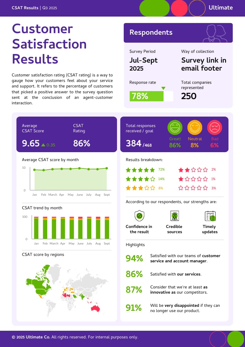
- Each visual in your report should have a purpose. Don’t just add a pie chart or bar graph for the sake of adding one. Your visual of choice should offer clarity to readers that’s impossible to achieve with words alone. Piktochart’s report maker lets you search for free stock images and illustrations to add to any page with drag and drop.
- Add captions, legends, or arrows to your visuals when possible. For more technical reports, graphics are either Tables or Figures. Number them in order of appearance (Figure 1, Figure 2, Table 1, etc.) and give each a descriptive title.
- Place the visual close to the relevant text on the page.
- Document the source of the visual, citing it in both the caption and references section if necessary.
- Make the graphic stand out with colors, borders, boxes, spacing, and frames.
Learn more : How to Improve Your Data Visualization Design in 6 Steps
Write reports like a pro with Piktochart’s easy-to-edit report templates
Creating reports from scratch can be time-consuming. The great news is you don’t have to make reports from scratch like how it used to be in the 90s and early 2000s. Organizations of all shapes and sizes now understand that you can also create the perfect report with the help of templates.
For example, Piktochart offers a variety of fully customizable templates, allowing you to easily add your branding, colors, and text within the online editor. You can visualize your thesis statement and first draft in less than an hour. It’s also possible to start writing directly in the tool, adding graphics page by page.
These templates range from reports for school presentations to sales reports. By editing them, you can create professional-looking reports without the hassle of formatting and design.
Here are some examples of Piktochart’s professionally-designed templates. If you can’t pick one that matches your report writing format and needs, create a free Piktochart account to get access to more templates.
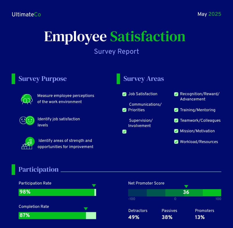
Survey report template
This survey report template includes clear visualizations, making your report findings easier to understand. From customer surveys to employee satisfaction reports, this template is quite versatile.
Research report template
This research report template is perfect for anyone looking to create a thorough and professional research report. The template includes all the necessary sections to help you easily organize your research and present your findings in a concise document.

Corporate report template
Looking for a corporate report template example with an editable table of contents and foreword? This template is the perfect fit!
Whether you’re presenting to investors or sharing information with your team, this corporate report template will help you create a polished and informative executive summary for any corporate organization.

Case study report template
Whether you’re conducting a business case study or an academic case study, this case study report template can help you earn your readers’ trust. This template is specifically designed with fashion as its main theme, but you can edit the photos and details to make it more on-brand with your niche.

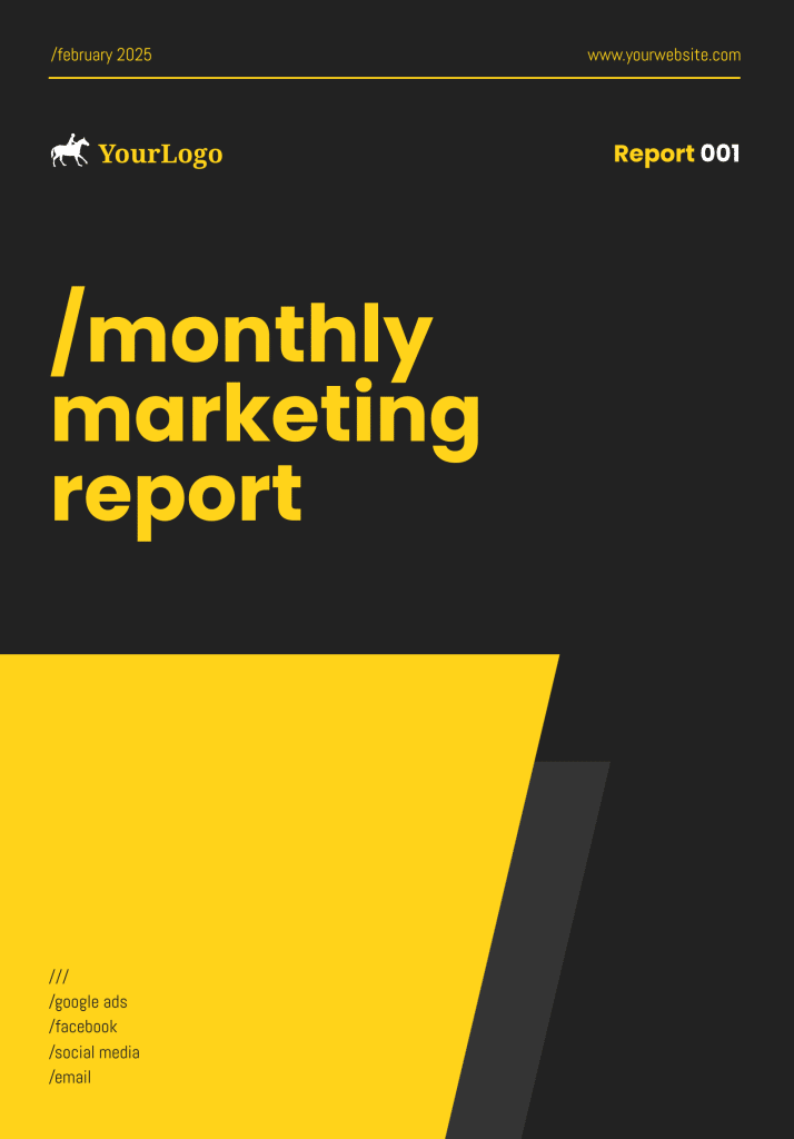
Marketing report template
Use this template to create comprehensive marketing reports. The template includes editable sections for social media, data from search engines, email marketing, and paid ads.
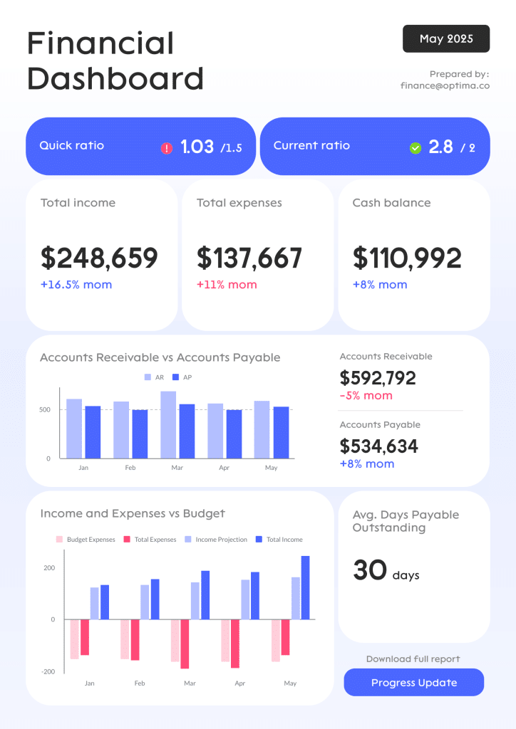
Financial report template
With this customizable finance report template, you don’t need to make a financial report from scratch. Once you’ve written your content, save your report in PDF or PNG formats.
Annual report template
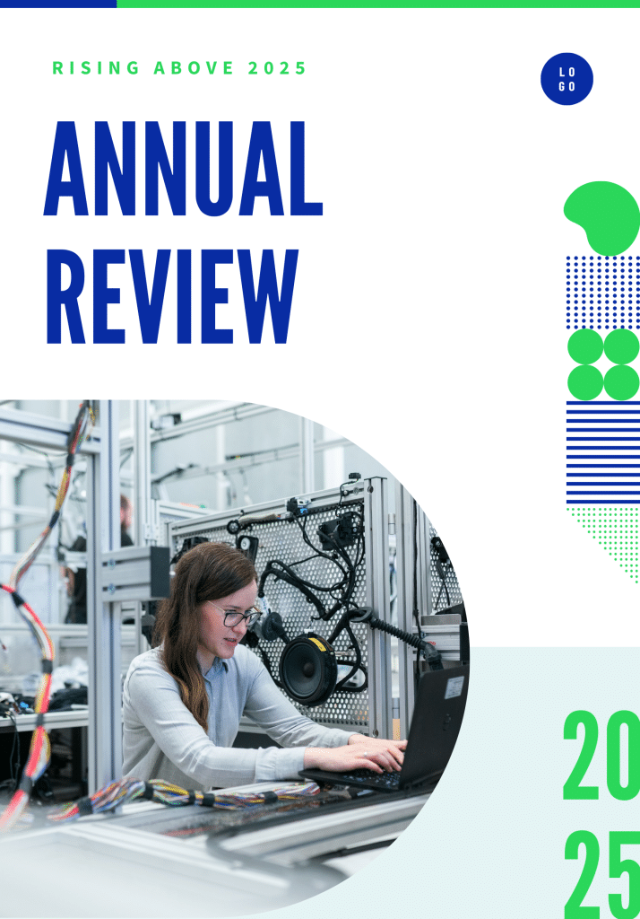
This annual report template is the right template for creating a professional and informative executive summary of your organization’s performance over the past year. This template was designed for HR annual reports, but you can also repurpose it for other types of yearly reports.
See more report templates by creating a free Piktochart account .
Quick checklist for better report writing
Before you submit or present your report, use the quick checklist below to help ensure that your report is well-structured, accurate, clear, and properly cited. Most of all, you must ensure that your report meets your audience’s expectations and has all the information and details they need.
Purpose and audience
- Does the report address its purpose and meet the needs of the intended audience?
Structure and organization
- Is the material appropriately arranged in sections?
- Have irrelevant details been removed?
Accuracy and analysis
- Has all the material been checked for accuracy?
- Are graphs and tables clearly labeled? Check the page numbers too.
- Is the data in graphs or tables analyzed and explained in words?
- Does the discussion or conclusion show how the results relate to the objectives mentioned in the introduction?
- Have the results been compared with existing research from the literature survey?
Writing style and clarity
- Is the report written in a tone that’s indicated in the brand style guide (for corporate reports)? Does it avoid colloquialisms or contractions?
- Does it follow the organization’s specific guidelines for writing style?
- Is it jargon-free and clearly written? Have you translated technical terms into simpler words?
- Use the active voice when you can because it helps improve clarity. A written report in a passive voice may make it sound less concise.
Acknowledgment and citation
- Have all ideas and event data taken from or inspired by someone else’s work been acknowledged with a reference?
- Have all illustrations and figures taken from someone else’s work been cited correctly?
Proofreading
- Has the report been carefully proofread for typos, spelling errors, and grammatical mistakes?
Make engaging and effective reports quickly with Piktochart
Writing a report is a must-have skill for anyone looking to communicate more effectively in their personal and professional lives.
With the steps we’ve provided in this guide, anyone can learn how to write a report that is informative, engaging, and comprehensive.
Plus, the free templates we highlighted are valuable for individuals looking to create reports quickly and efficiently. They can also be used to transform a longer report filled with texts into something more engaging and easy to digest.
Sign up for a free Piktochart account today, and look forward to writing reports with its library of modern, customizable report templates.
Piktochart offers professionally designed templates for all your visual communication needs. It is your one-stop shop for presentations , posters , logos , email signatures , infographics , and more. Customize all templates according to your brand assets in seconds. Get started for free today.

Other Posts
10 Best Sales Report Templates for Tracking Revenue, KPIs & Growth
10 Types of HR Reports (With Templates and Examples)
7 Captivating Report Design Ideas And Tips (With Templates and Examples)
Home Blog Design Understanding Data Presentations (Guide + Examples)
Understanding Data Presentations (Guide + Examples)

In this age of overwhelming information, the skill to effectively convey data has become extremely valuable. Initiating a discussion on data presentation types involves thoughtful consideration of the nature of your data and the message you aim to convey. Different types of visualizations serve distinct purposes. Whether you’re dealing with how to develop a report or simply trying to communicate complex information, how you present data influences how well your audience understands and engages with it. This extensive guide leads you through the different ways of data presentation.
Table of Contents
What is a Data Presentation?
What should a data presentation include, line graphs, treemap chart, scatter plot, how to choose a data presentation type, recommended data presentation templates, common mistakes done in data presentation.
A data presentation is a slide deck that aims to disclose quantitative information to an audience through the use of visual formats and narrative techniques derived from data analysis, making complex data understandable and actionable. This process requires a series of tools, such as charts, graphs, tables, infographics, dashboards, and so on, supported by concise textual explanations to improve understanding and boost retention rate.
Data presentations require us to cull data in a format that allows the presenter to highlight trends, patterns, and insights so that the audience can act upon the shared information. In a few words, the goal of data presentations is to enable viewers to grasp complicated concepts or trends quickly, facilitating informed decision-making or deeper analysis.
Data presentations go beyond the mere usage of graphical elements. Seasoned presenters encompass visuals with the art of data storytelling , so the speech skillfully connects the points through a narrative that resonates with the audience. Depending on the purpose – inspire, persuade, inform, support decision-making processes, etc. – is the data presentation format that is better suited to help us in this journey.
To nail your upcoming data presentation, ensure to count with the following elements:
- Clear Objectives: Understand the intent of your presentation before selecting the graphical layout and metaphors to make content easier to grasp.
- Engaging introduction: Use a powerful hook from the get-go. For instance, you can ask a big question or present a problem that your data will answer. Take a look at our guide on how to start a presentation for tips & insights.
- Structured Narrative: Your data presentation must tell a coherent story. This means a beginning where you present the context, a middle section in which you present the data, and an ending that uses a call-to-action. Check our guide on presentation structure for further information.
- Visual Elements: These are the charts, graphs, and other elements of visual communication we ought to use to present data. This article will cover one by one the different types of data representation methods we can use, and provide further guidance on choosing between them.
- Insights and Analysis: This is not just showcasing a graph and letting people get an idea about it. A proper data presentation includes the interpretation of that data, the reason why it’s included, and why it matters to your research.
- Conclusion & CTA: Ending your presentation with a call to action is necessary. Whether you intend to wow your audience into acquiring your services, inspire them to change the world, or whatever the purpose of your presentation, there must be a stage in which you convey all that you shared and show the path to staying in touch. Plan ahead whether you want to use a thank-you slide, a video presentation, or which method is apt and tailored to the kind of presentation you deliver.
- Q&A Session: After your speech is concluded, allocate 3-5 minutes for the audience to raise any questions about the information you disclosed. This is an extra chance to establish your authority on the topic. Check our guide on questions and answer sessions in presentations here.
Bar charts are a graphical representation of data using rectangular bars to show quantities or frequencies in an established category. They make it easy for readers to spot patterns or trends. Bar charts can be horizontal or vertical, although the vertical format is commonly known as a column chart. They display categorical, discrete, or continuous variables grouped in class intervals [1] . They include an axis and a set of labeled bars horizontally or vertically. These bars represent the frequencies of variable values or the values themselves. Numbers on the y-axis of a vertical bar chart or the x-axis of a horizontal bar chart are called the scale.

Real-Life Application of Bar Charts
Let’s say a sales manager is presenting sales to their audience. Using a bar chart, he follows these steps.
Step 1: Selecting Data
The first step is to identify the specific data you will present to your audience.
The sales manager has highlighted these products for the presentation.
- Product A: Men’s Shoes
- Product B: Women’s Apparel
- Product C: Electronics
- Product D: Home Decor
Step 2: Choosing Orientation
Opt for a vertical layout for simplicity. Vertical bar charts help compare different categories in case there are not too many categories [1] . They can also help show different trends. A vertical bar chart is used where each bar represents one of the four chosen products. After plotting the data, it is seen that the height of each bar directly represents the sales performance of the respective product.
It is visible that the tallest bar (Electronics – Product C) is showing the highest sales. However, the shorter bars (Women’s Apparel – Product B and Home Decor – Product D) need attention. It indicates areas that require further analysis or strategies for improvement.
Step 3: Colorful Insights
Different colors are used to differentiate each product. It is essential to show a color-coded chart where the audience can distinguish between products.
- Men’s Shoes (Product A): Yellow
- Women’s Apparel (Product B): Orange
- Electronics (Product C): Violet
- Home Decor (Product D): Blue

Bar charts are straightforward and easily understandable for presenting data. They are versatile when comparing products or any categorical data [2] . Bar charts adapt seamlessly to retail scenarios. Despite that, bar charts have a few shortcomings. They cannot illustrate data trends over time. Besides, overloading the chart with numerous products can lead to visual clutter, diminishing its effectiveness.
For more information, check our collection of bar chart templates for PowerPoint .
Line graphs help illustrate data trends, progressions, or fluctuations by connecting a series of data points called ‘markers’ with straight line segments. This provides a straightforward representation of how values change [5] . Their versatility makes them invaluable for scenarios requiring a visual understanding of continuous data. In addition, line graphs are also useful for comparing multiple datasets over the same timeline. Using multiple line graphs allows us to compare more than one data set. They simplify complex information so the audience can quickly grasp the ups and downs of values. From tracking stock prices to analyzing experimental results, you can use line graphs to show how data changes over a continuous timeline. They show trends with simplicity and clarity.
Real-life Application of Line Graphs
To understand line graphs thoroughly, we will use a real case. Imagine you’re a financial analyst presenting a tech company’s monthly sales for a licensed product over the past year. Investors want insights into sales behavior by month, how market trends may have influenced sales performance and reception to the new pricing strategy. To present data via a line graph, you will complete these steps.
First, you need to gather the data. In this case, your data will be the sales numbers. For example:
- January: $45,000
- February: $55,000
- March: $45,000
- April: $60,000
- May: $ 70,000
- June: $65,000
- July: $62,000
- August: $68,000
- September: $81,000
- October: $76,000
- November: $87,000
- December: $91,000
After choosing the data, the next step is to select the orientation. Like bar charts, you can use vertical or horizontal line graphs. However, we want to keep this simple, so we will keep the timeline (x-axis) horizontal while the sales numbers (y-axis) vertical.
Step 3: Connecting Trends
After adding the data to your preferred software, you will plot a line graph. In the graph, each month’s sales are represented by data points connected by a line.

Step 4: Adding Clarity with Color
If there are multiple lines, you can also add colors to highlight each one, making it easier to follow.
Line graphs excel at visually presenting trends over time. These presentation aids identify patterns, like upward or downward trends. However, too many data points can clutter the graph, making it harder to interpret. Line graphs work best with continuous data but are not suitable for categories.
For more information, check our collection of line chart templates for PowerPoint and our article about how to make a presentation graph .
A data dashboard is a visual tool for analyzing information. Different graphs, charts, and tables are consolidated in a layout to showcase the information required to achieve one or more objectives. Dashboards help quickly see Key Performance Indicators (KPIs). You don’t make new visuals in the dashboard; instead, you use it to display visuals you’ve already made in worksheets [3] .
Keeping the number of visuals on a dashboard to three or four is recommended. Adding too many can make it hard to see the main points [4]. Dashboards can be used for business analytics to analyze sales, revenue, and marketing metrics at a time. They are also used in the manufacturing industry, as they allow users to grasp the entire production scenario at the moment while tracking the core KPIs for each line.
Real-Life Application of a Dashboard
Consider a project manager presenting a software development project’s progress to a tech company’s leadership team. He follows the following steps.
Step 1: Defining Key Metrics
To effectively communicate the project’s status, identify key metrics such as completion status, budget, and bug resolution rates. Then, choose measurable metrics aligned with project objectives.
Step 2: Choosing Visualization Widgets
After finalizing the data, presentation aids that align with each metric are selected. For this project, the project manager chooses a progress bar for the completion status and uses bar charts for budget allocation. Likewise, he implements line charts for bug resolution rates.

Step 3: Dashboard Layout
Key metrics are prominently placed in the dashboard for easy visibility, and the manager ensures that it appears clean and organized.
Dashboards provide a comprehensive view of key project metrics. Users can interact with data, customize views, and drill down for detailed analysis. However, creating an effective dashboard requires careful planning to avoid clutter. Besides, dashboards rely on the availability and accuracy of underlying data sources.
For more information, check our article on how to design a dashboard presentation , and discover our collection of dashboard PowerPoint templates .
Treemap charts represent hierarchical data structured in a series of nested rectangles [6] . As each branch of the ‘tree’ is given a rectangle, smaller tiles can be seen representing sub-branches, meaning elements on a lower hierarchical level than the parent rectangle. Each one of those rectangular nodes is built by representing an area proportional to the specified data dimension.
Treemaps are useful for visualizing large datasets in compact space. It is easy to identify patterns, such as which categories are dominant. Common applications of the treemap chart are seen in the IT industry, such as resource allocation, disk space management, website analytics, etc. Also, they can be used in multiple industries like healthcare data analysis, market share across different product categories, or even in finance to visualize portfolios.
Real-Life Application of a Treemap Chart
Let’s consider a financial scenario where a financial team wants to represent the budget allocation of a company. There is a hierarchy in the process, so it is helpful to use a treemap chart. In the chart, the top-level rectangle could represent the total budget, and it would be subdivided into smaller rectangles, each denoting a specific department. Further subdivisions within these smaller rectangles might represent individual projects or cost categories.
Step 1: Define Your Data Hierarchy
While presenting data on the budget allocation, start by outlining the hierarchical structure. The sequence will be like the overall budget at the top, followed by departments, projects within each department, and finally, individual cost categories for each project.
- Top-level rectangle: Total Budget
- Second-level rectangles: Departments (Engineering, Marketing, Sales)
- Third-level rectangles: Projects within each department
- Fourth-level rectangles: Cost categories for each project (Personnel, Marketing Expenses, Equipment)
Step 2: Choose a Suitable Tool
It’s time to select a data visualization tool supporting Treemaps. Popular choices include Tableau, Microsoft Power BI, PowerPoint, or even coding with libraries like D3.js. It is vital to ensure that the chosen tool provides customization options for colors, labels, and hierarchical structures.
Here, the team uses PowerPoint for this guide because of its user-friendly interface and robust Treemap capabilities.
Step 3: Make a Treemap Chart with PowerPoint
After opening the PowerPoint presentation, they chose “SmartArt” to form the chart. The SmartArt Graphic window has a “Hierarchy” category on the left. Here, you will see multiple options. You can choose any layout that resembles a Treemap. The “Table Hierarchy” or “Organization Chart” options can be adapted. The team selects the Table Hierarchy as it looks close to a Treemap.
Step 5: Input Your Data
After that, a new window will open with a basic structure. They add the data one by one by clicking on the text boxes. They start with the top-level rectangle, representing the total budget.

Step 6: Customize the Treemap
By clicking on each shape, they customize its color, size, and label. At the same time, they can adjust the font size, style, and color of labels by using the options in the “Format” tab in PowerPoint. Using different colors for each level enhances the visual difference.
Treemaps excel at illustrating hierarchical structures. These charts make it easy to understand relationships and dependencies. They efficiently use space, compactly displaying a large amount of data, reducing the need for excessive scrolling or navigation. Additionally, using colors enhances the understanding of data by representing different variables or categories.
In some cases, treemaps might become complex, especially with deep hierarchies. It becomes challenging for some users to interpret the chart. At the same time, displaying detailed information within each rectangle might be constrained by space. It potentially limits the amount of data that can be shown clearly. Without proper labeling and color coding, there’s a risk of misinterpretation.
A heatmap is a data visualization tool that uses color coding to represent values across a two-dimensional surface. In these, colors replace numbers to indicate the magnitude of each cell. This color-shaded matrix display is valuable for summarizing and understanding data sets with a glance [7] . The intensity of the color corresponds to the value it represents, making it easy to identify patterns, trends, and variations in the data.
As a tool, heatmaps help businesses analyze website interactions, revealing user behavior patterns and preferences to enhance overall user experience. In addition, companies use heatmaps to assess content engagement, identifying popular sections and areas of improvement for more effective communication. They excel at highlighting patterns and trends in large datasets, making it easy to identify areas of interest.
We can implement heatmaps to express multiple data types, such as numerical values, percentages, or even categorical data. Heatmaps help us easily spot areas with lots of activity, making them helpful in figuring out clusters [8] . When making these maps, it is important to pick colors carefully. The colors need to show the differences between groups or levels of something. And it is good to use colors that people with colorblindness can easily see.
Check our detailed guide on how to create a heatmap here. Also discover our collection of heatmap PowerPoint templates .
Pie charts are circular statistical graphics divided into slices to illustrate numerical proportions. Each slice represents a proportionate part of the whole, making it easy to visualize the contribution of each component to the total.
The size of the pie charts is influenced by the value of data points within each pie. The total of all data points in a pie determines its size. The pie with the highest data points appears as the largest, whereas the others are proportionally smaller. However, you can present all pies of the same size if proportional representation is not required [9] . Sometimes, pie charts are difficult to read, or additional information is required. A variation of this tool can be used instead, known as the donut chart , which has the same structure but a blank center, creating a ring shape. Presenters can add extra information, and the ring shape helps to declutter the graph.
Pie charts are used in business to show percentage distribution, compare relative sizes of categories, or present straightforward data sets where visualizing ratios is essential.
Real-Life Application of Pie Charts
Consider a scenario where you want to represent the distribution of the data. Each slice of the pie chart would represent a different category, and the size of each slice would indicate the percentage of the total portion allocated to that category.
Step 1: Define Your Data Structure
Imagine you are presenting the distribution of a project budget among different expense categories.
- Column A: Expense Categories (Personnel, Equipment, Marketing, Miscellaneous)
- Column B: Budget Amounts ($40,000, $30,000, $20,000, $10,000) Column B represents the values of your categories in Column A.
Step 2: Insert a Pie Chart
Using any of the accessible tools, you can create a pie chart. The most convenient tools for forming a pie chart in a presentation are presentation tools such as PowerPoint or Google Slides. You will notice that the pie chart assigns each expense category a percentage of the total budget by dividing it by the total budget.
For instance:
- Personnel: $40,000 / ($40,000 + $30,000 + $20,000 + $10,000) = 40%
- Equipment: $30,000 / ($40,000 + $30,000 + $20,000 + $10,000) = 30%
- Marketing: $20,000 / ($40,000 + $30,000 + $20,000 + $10,000) = 20%
- Miscellaneous: $10,000 / ($40,000 + $30,000 + $20,000 + $10,000) = 10%
You can make a chart out of this or just pull out the pie chart from the data.

3D pie charts and 3D donut charts are quite popular among the audience. They stand out as visual elements in any presentation slide, so let’s take a look at how our pie chart example would look in 3D pie chart format.

Step 03: Results Interpretation
The pie chart visually illustrates the distribution of the project budget among different expense categories. Personnel constitutes the largest portion at 40%, followed by equipment at 30%, marketing at 20%, and miscellaneous at 10%. This breakdown provides a clear overview of where the project funds are allocated, which helps in informed decision-making and resource management. It is evident that personnel are a significant investment, emphasizing their importance in the overall project budget.
Pie charts provide a straightforward way to represent proportions and percentages. They are easy to understand, even for individuals with limited data analysis experience. These charts work well for small datasets with a limited number of categories.
However, a pie chart can become cluttered and less effective in situations with many categories. Accurate interpretation may be challenging, especially when dealing with slight differences in slice sizes. In addition, these charts are static and do not effectively convey trends over time.
For more information, check our collection of pie chart templates for PowerPoint .
Histograms present the distribution of numerical variables. Unlike a bar chart that records each unique response separately, histograms organize numeric responses into bins and show the frequency of reactions within each bin [10] . The x-axis of a histogram shows the range of values for a numeric variable. At the same time, the y-axis indicates the relative frequencies (percentage of the total counts) for that range of values.
Whenever you want to understand the distribution of your data, check which values are more common, or identify outliers, histograms are your go-to. Think of them as a spotlight on the story your data is telling. A histogram can provide a quick and insightful overview if you’re curious about exam scores, sales figures, or any numerical data distribution.
Real-Life Application of a Histogram
In the histogram data analysis presentation example, imagine an instructor analyzing a class’s grades to identify the most common score range. A histogram could effectively display the distribution. It will show whether most students scored in the average range or if there are significant outliers.
Step 1: Gather Data
He begins by gathering the data. The scores of each student in class are gathered to analyze exam scores.
After arranging the scores in ascending order, bin ranges are set.
Step 2: Define Bins
Bins are like categories that group similar values. Think of them as buckets that organize your data. The presenter decides how wide each bin should be based on the range of the values. For instance, the instructor sets the bin ranges based on score intervals: 60-69, 70-79, 80-89, and 90-100.
Step 3: Count Frequency
Now, he counts how many data points fall into each bin. This step is crucial because it tells you how often specific ranges of values occur. The result is the frequency distribution, showing the occurrences of each group.
Here, the instructor counts the number of students in each category.
- 60-69: 1 student (Kate)
- 70-79: 4 students (David, Emma, Grace, Jack)
- 80-89: 7 students (Alice, Bob, Frank, Isabel, Liam, Mia, Noah)
- 90-100: 3 students (Clara, Henry, Olivia)
Step 4: Create the Histogram
It’s time to turn the data into a visual representation. Draw a bar for each bin on a graph. The width of the bar should correspond to the range of the bin, and the height should correspond to the frequency. To make your histogram understandable, label the X and Y axes.
In this case, the X-axis should represent the bins (e.g., test score ranges), and the Y-axis represents the frequency.

The histogram of the class grades reveals insightful patterns in the distribution. Most students, with seven students, fall within the 80-89 score range. The histogram provides a clear visualization of the class’s performance. It showcases a concentration of grades in the upper-middle range with few outliers at both ends. This analysis helps in understanding the overall academic standing of the class. It also identifies the areas for potential improvement or recognition.
Thus, histograms provide a clear visual representation of data distribution. They are easy to interpret, even for those without a statistical background. They apply to various types of data, including continuous and discrete variables. One weak point is that histograms do not capture detailed patterns in students’ data, with seven compared to other visualization methods.
A scatter plot is a graphical representation of the relationship between two variables. It consists of individual data points on a two-dimensional plane. This plane plots one variable on the x-axis and the other on the y-axis. Each point represents a unique observation. It visualizes patterns, trends, or correlations between the two variables.
Scatter plots are also effective in revealing the strength and direction of relationships. They identify outliers and assess the overall distribution of data points. The points’ dispersion and clustering reflect the relationship’s nature, whether it is positive, negative, or lacks a discernible pattern. In business, scatter plots assess relationships between variables such as marketing cost and sales revenue. They help present data correlations and decision-making.
Real-Life Application of Scatter Plot
A group of scientists is conducting a study on the relationship between daily hours of screen time and sleep quality. After reviewing the data, they managed to create this table to help them build a scatter plot graph:
In the provided example, the x-axis represents Daily Hours of Screen Time, and the y-axis represents the Sleep Quality Rating.

The scientists observe a negative correlation between the amount of screen time and the quality of sleep. This is consistent with their hypothesis that blue light, especially before bedtime, has a significant impact on sleep quality and metabolic processes.
There are a few things to remember when using a scatter plot. Even when a scatter diagram indicates a relationship, it doesn’t mean one variable affects the other. A third factor can influence both variables. The more the plot resembles a straight line, the stronger the relationship is perceived [11] . If it suggests no ties, the observed pattern might be due to random fluctuations in data. When the scatter diagram depicts no correlation, whether the data might be stratified is worth considering.
Choosing the appropriate data presentation type is crucial when making a presentation . Understanding the nature of your data and the message you intend to convey will guide this selection process. For instance, when showcasing quantitative relationships, scatter plots become instrumental in revealing correlations between variables. If the focus is on emphasizing parts of a whole, pie charts offer a concise display of proportions. Histograms, on the other hand, prove valuable for illustrating distributions and frequency patterns.
Bar charts provide a clear visual comparison of different categories. Likewise, line charts excel in showcasing trends over time, while tables are ideal for detailed data examination. Starting a presentation on data presentation types involves evaluating the specific information you want to communicate and selecting the format that aligns with your message. This ensures clarity and resonance with your audience from the beginning of your presentation.
1. Fact Sheet Dashboard for Data Presentation

Convey all the data you need to present in this one-pager format, an ideal solution tailored for users looking for presentation aids. Global maps, donut chats, column graphs, and text neatly arranged in a clean layout presented in light and dark themes.
Use This Template
2. 3D Column Chart Infographic PPT Template

Represent column charts in a highly visual 3D format with this PPT template. A creative way to present data, this template is entirely editable, and we can craft either a one-page infographic or a series of slides explaining what we intend to disclose point by point.
3. Data Circles Infographic PowerPoint Template

An alternative to the pie chart and donut chart diagrams, this template features a series of curved shapes with bubble callouts as ways of presenting data. Expand the information for each arch in the text placeholder areas.
4. Colorful Metrics Dashboard for Data Presentation

This versatile dashboard template helps us in the presentation of the data by offering several graphs and methods to convert numbers into graphics. Implement it for e-commerce projects, financial projections, project development, and more.
5. Animated Data Presentation Tools for PowerPoint & Google Slides

A slide deck filled with most of the tools mentioned in this article, from bar charts, column charts, treemap graphs, pie charts, histogram, etc. Animated effects make each slide look dynamic when sharing data with stakeholders.
6. Statistics Waffle Charts PPT Template for Data Presentations

This PPT template helps us how to present data beyond the typical pie chart representation. It is widely used for demographics, so it’s a great fit for marketing teams, data science professionals, HR personnel, and more.
7. Data Presentation Dashboard Template for Google Slides

A compendium of tools in dashboard format featuring line graphs, bar charts, column charts, and neatly arranged placeholder text areas.
8. Weather Dashboard for Data Presentation

Share weather data for agricultural presentation topics, environmental studies, or any kind of presentation that requires a highly visual layout for weather forecasting on a single day. Two color themes are available.
9. Social Media Marketing Dashboard Data Presentation Template

Intended for marketing professionals, this dashboard template for data presentation is a tool for presenting data analytics from social media channels. Two slide layouts featuring line graphs and column charts.
10. Project Management Summary Dashboard Template

A tool crafted for project managers to deliver highly visual reports on a project’s completion, the profits it delivered for the company, and expenses/time required to execute it. 4 different color layouts are available.
11. Profit & Loss Dashboard for PowerPoint and Google Slides

A must-have for finance professionals. This typical profit & loss dashboard includes progress bars, donut charts, column charts, line graphs, and everything that’s required to deliver a comprehensive report about a company’s financial situation.
Overwhelming visuals
One of the mistakes related to using data-presenting methods is including too much data or using overly complex visualizations. They can confuse the audience and dilute the key message.
Inappropriate chart types
Choosing the wrong type of chart for the data at hand can lead to misinterpretation. For example, using a pie chart for data that doesn’t represent parts of a whole is not right.
Lack of context
Failing to provide context or sufficient labeling can make it challenging for the audience to understand the significance of the presented data.
Inconsistency in design
Using inconsistent design elements and color schemes across different visualizations can create confusion and visual disarray.
Failure to provide details
Simply presenting raw data without offering clear insights or takeaways can leave the audience without a meaningful conclusion.
Lack of focus
Not having a clear focus on the key message or main takeaway can result in a presentation that lacks a central theme.
Visual accessibility issues
Overlooking the visual accessibility of charts and graphs can exclude certain audience members who may have difficulty interpreting visual information.
In order to avoid these mistakes in data presentation, presenters can benefit from using presentation templates . These templates provide a structured framework. They ensure consistency, clarity, and an aesthetically pleasing design, enhancing data communication’s overall impact.
Understanding and choosing data presentation types are pivotal in effective communication. Each method serves a unique purpose, so selecting the appropriate one depends on the nature of the data and the message to be conveyed. The diverse array of presentation types offers versatility in visually representing information, from bar charts showing values to pie charts illustrating proportions.
Using the proper method enhances clarity, engages the audience, and ensures that data sets are not just presented but comprehensively understood. By appreciating the strengths and limitations of different presentation types, communicators can tailor their approach to convey information accurately, developing a deeper connection between data and audience understanding.
[1] Government of Canada, S.C. (2021) 5 Data Visualization 5.2 Bar Chart , 5.2 Bar chart . https://www150.statcan.gc.ca/n1/edu/power-pouvoir/ch9/bargraph-diagrammeabarres/5214818-eng.htm
[2] Kosslyn, S.M., 1989. Understanding charts and graphs. Applied cognitive psychology, 3(3), pp.185-225. https://apps.dtic.mil/sti/pdfs/ADA183409.pdf
[3] Creating a Dashboard . https://it.tufts.edu/book/export/html/1870
[4] https://www.goldenwestcollege.edu/research/data-and-more/data-dashboards/index.html
[5] https://www.mit.edu/course/21/21.guide/grf-line.htm
[6] Jadeja, M. and Shah, K., 2015, January. Tree-Map: A Visualization Tool for Large Data. In GSB@ SIGIR (pp. 9-13). https://ceur-ws.org/Vol-1393/gsb15proceedings.pdf#page=15
[7] Heat Maps and Quilt Plots. https://www.publichealth.columbia.edu/research/population-health-methods/heat-maps-and-quilt-plots
[8] EIU QGIS WORKSHOP. https://www.eiu.edu/qgisworkshop/heatmaps.php
[9] About Pie Charts. https://www.mit.edu/~mbarker/formula1/f1help/11-ch-c8.htm
[10] Histograms. https://sites.utexas.edu/sos/guided/descriptive/numericaldd/descriptiven2/histogram/ [11] https://asq.org/quality-resources/scatter-diagram

Like this article? Please share
Data Analysis, Data Science, Data Visualization Filed under Design
Related Articles

Filed under Design • March 27th, 2024
How to Make a Presentation Graph
Detailed step-by-step instructions to master the art of how to make a presentation graph in PowerPoint and Google Slides. Check it out!
Filed under Presentation Ideas • January 6th, 2024
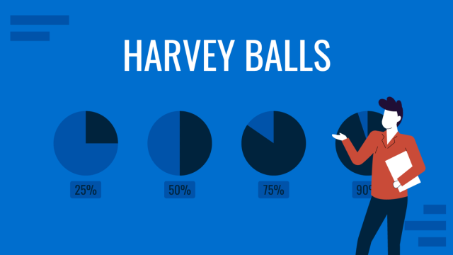
All About Using Harvey Balls
Among the many tools in the arsenal of the modern presenter, Harvey Balls have a special place. In this article we will tell you all about using Harvey Balls.
Filed under Business • December 8th, 2023
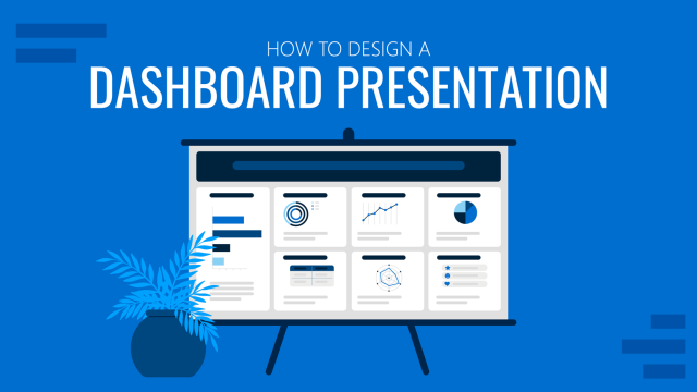
How to Design a Dashboard Presentation: A Step-by-Step Guide
Take a step further in your professional presentation skills by learning what a dashboard presentation is and how to properly design one in PowerPoint. A detailed step-by-step guide is here!
Leave a Reply
- October 2024: Report Redesign
- November 2024: Powerful Presentations
- December 2024: Dashboard Design
- Self-Paced: Soar Beyond the Dusty Shelf Report
- Full-Day Workshops
- Conference Keynotes
- Shirts & Hoodies
- Chart Templates

27 Comments
This was a great tutorial. Thank you for providing! I am designing my next report in PPT right now! Shhhh! ~Jessica, Child Advocates of Fort Bend
Your secret’s safe with us. 🙂
Woohoo! I’m glad this list has inspired you Jessica! Your secret is safe 🙂 Happy PowerPoint-ing!
wow, what a beautiful report in PP! Can you share it with us please? Thanks in advance
Hi Hossat, This report’s not available for download, sorry! It’s an internal report that Nick designed specifically for his audience. One of these days, “in all my spare time,” I’ll design some sort of template for these reports. Until then, I hope you find the behind-the-scenes screenshots to be useful.
Great post! I plan to use tip #3 right away. I use Nancy Duarte’s slidedoc format for reports and like this 8.5″ x 11″ option too.
Learning about “Align” a few years ago has already saved hours of my precious time! It’s the little things.
This tip was probably the simplest game changer for me. This works for everything (and in most MS Office applications ) for things like conference posters, handouts, reports, ACTUAL powerpoint slide decks… It’s really nice once you realize you’ll never have to nudge objects click by click anymore!
Nick — I literally used to zoom waaaaaaay to 400% or 500% on my screen, hold up a ruler, and eyeball all my text boxes to “align” them. Oops.
Does anyone know of any templates that already exist with it rotated and filled in content
Hi Jeremy, Check out https://www.duarte.com/slidedocs/ . THE trailblazer in “slidedocs” is Nancy Duarte and the dozens of staff at her company. I believe they have free templates to get you started. Like any templates, you’ll want to adjust the colors and fonts, at a bare minimum, so that it doesn’t look so default. Let me know if you encounter any other helpful templates.
Thanks for sharing this, great idea! Formatting on Word has always been a challenge for me
Hello, This is great! Do the reports created in Powerpoint meet accessibility standards for folks who use screen readers, etc.?
Great question. Someone asked this question on Twitter too. Here’s what I said: “I don’t see why it wouldn’t. Reports can be written in any software program (Word, PowerPoint, InDesign, Publisher, etc etc etc) and then PDF’d. I believe you can tag tables and images in any program.” And here’s what Nick said: “Using Accessibility Checker in PPT (as in Word) is important when creating… then when publishing to PDF, there a couple more clicks I think to make sure it exports as an accessible doc – found this in my search: http://lpc1.clpccd.cc.ca.us/lpc/blackboard/accessible_ppt/convert_ppt.htm ” Let us know what you learn in your search, too.
Definitely can Marissa, you just need to create the document in a way that’s accessible (as you probably normally would in Word) can use accessibility checker in PowerPoint when creating the report to see whch elements need alt text, etc and then follow these instructions when exporting to PDF: https://t.co/OrMkFSxihM
Hi Ann and Nick: a) Another way to get matching colors in different objects (point 5 of your post) without too much concern over if its well done, is to play with Saturation: 1- Shape Fill 2 – More Fill Colors 3 – Custom tab 4 – Color Model HSL 5 – And play with different levels of Saturation b) If we want to print the report directely from the PPT we must take in consideratin that the printer always put a white margin that we can’t see even at the Print Preview. Thanks for the post Miguel
This is a great point Miguel. I often click between my edit view and print preview when I’m making reports to see how it will print if I were to do so directly from ppt so I can check what that white border looks like and if it impacts anything I have on the page, especially important when bleeding images or objects over the page edges. This is one reason you want to be sure to custom format your page layout too, manually enter 8.5 width and 11 length instead of relying on the default “letter” size option that ppt gives you, which actually defaults the slide to 7.5 X 10. Thanks for the color tip too, I’ll try that out!
This is very interesting post on report creation in PowerPoint.
[…] How to Write Your Reports in PowerPoint Instead of Word: 9 Tips for Getting Started […]
Finally, it becomes easier to use MS powerpoint in terms of writing reports as my MS word was showing errors.
Great post, thank you. As a consultant I write reports for a living. I grew up on Word and was trained to write word-heavy, long form reports. Whilst I (think I) do that very well, I’m conscious that these days many people prefer shorter, more visual reports so I’m exploring how I might transition to that. Two issue I’ve always had with ppt are (1) the way it resizes text when I don’t want it to and (2) the way it works one page at a time, i.e. text doesn’t flow from one page to the next. Is there a way to address either of these? Might Publisher (which I’ve never really used; does it even still exist?) be a good alternative tool for the job?
Hi Patch, Argh yes, I have the same frustrations with PowerPoint.
Rather than using the built-in text boxes, which automatically re-size the text, I delete those and add my own. Then I have full control over the text formatting.
I don’t know how to adjust the page breaks/page flow; don’t think this is possible actually (?). I plan the content carefully in advance (by spending time developing a detailed outline). Then, I make sure that each topic simply fits on its own page.
You’re certainly welcome to continue using Word! Or, Publisher. But PowerPoint does tend to be easiest to use as you add more visuals to your reports.
Good luck! Ann
Thanks. When do u prefer portrait or landscape orientation?
I’m trying to use landscape as much as possible these days — since so many people are reading the reports from their computers.
Interesting but I fail to see the benefit. Why not just use Word with PowerPoint inserts for powerful reports (or for that matter insert PowerBI).
I just find PowerPoint to be more artistic since it requires so much careful manipulation of content – an issue I simply don’t have in Word.
Word’s great for text-heavy reports. PowerPoint’s great for visual-heavy reports. They each have their own value.
Leave a Reply Cancel reply
Your email address will not be published. Required fields are marked *
Save my name, email, and website in this browser for the next time I comment.
How to Write Your Reports in PowerPoint Instead of Word: Nine Tips for Getting Started
Hi! My name is Nick Visscher, I’m an internal evaluator with Denver Zoo. Our data work spans the gamut from collecting guest satisfaction insights to observing preschool kids in our nature play programming. With everything our team does we aim to help our staff improve their programs and our guest’s experience. It’s important for us to disseminate our findings in ways that make our stakeholders (mainly internal staff) to dig in and explore. Clear, concise, and well visualized reporting is super important and something we are passionate about.
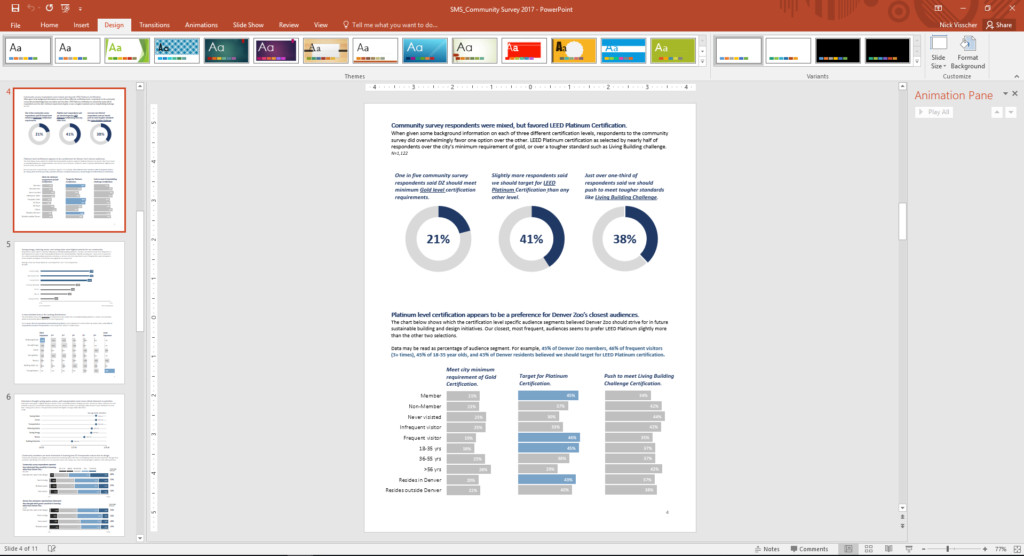
There are so many options when it comes to reporting software, but one familiar face I often find myself turning to is Microsoft PowerPoint. You might not immediately think of PowerPoint when it comes to creating formal reports, but I love using it in lieu of more common applications like Word. Positioning new images and text boxes into a document is just easier in PowerPoint. You don’t need to worry about anchoring items or how inserting new text might change the position of items you’ve already included on a page. It’s a blank canvas without many limitations.
Here are some screenshots from a report that I wrote in PowerPoint. These pages come from our Lorikeet Adventure: Guest Experience Research Brief.
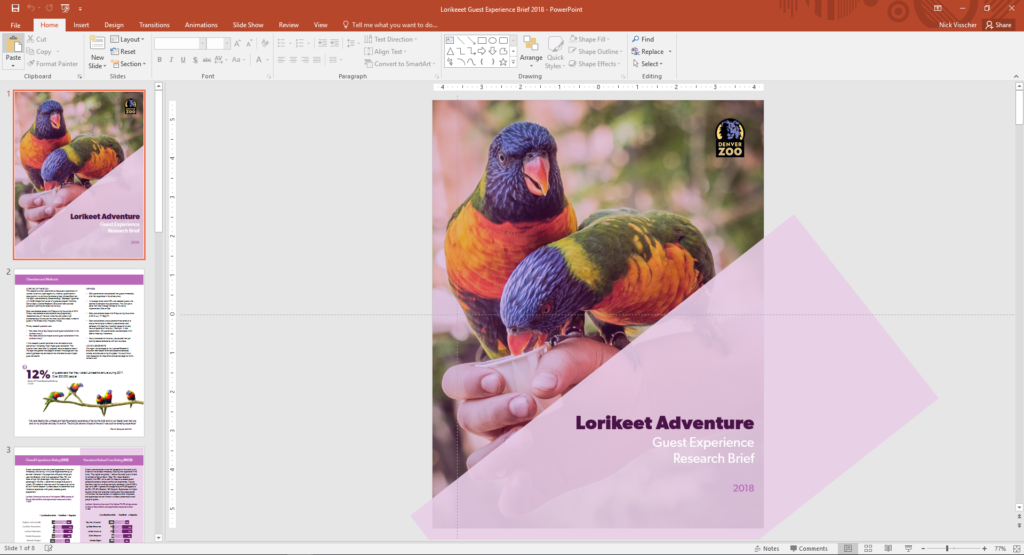
Here are a few tips I keep in mind when using PowerPoint to design my evaluation reports. Note: I’m working in MS Office 2016.
- Changing slide orientation : I like a traditional page layout for a report I know my readers will likely print, not the default slide size (16:9 aspect ratio). To change it, I go to the Design pane and create a custom slide size, change the settings to 8.5” by 11”, and select a Portrait orientation.
- Making use of the page ruler, gridlines, and guides : In the View pane I always select Ruler and Guides (and sometime Gridlines) so I can make sure key text and objects are in the same position on each page. I also know my readers will likely print and use a staple in the upper left corner so I make sure to keep one guide line at a half inch from the left. This lets me position headers and text where I know a staple won’t get in the way.
- Using built in arrangement options for multiple text boxes or images : Don’t spend too much time clicking that left arrow or right arrow to “nudge” objects into just the right place on a page. Select all the objects you wish to align, go to the Home pane, select Arrange, and then select Align. There are built in arrangement options there which perfectly align or evenly distribute everything at once. This is one feature that consistently saves me time and makes everything look better.
- Inserting shapes and lines as design elements : I love using basic shapes and lines in different variations on a page to give the design of a report a sleek and professional feel. I avoid predefined slide design templates at all costs, they don’t often follow the principles of good design.
- Using fill color and transparency : I’m not always confident in knowing which colors compliment each other so to avoid having to pick different colors, but still give some visual variation, I increase the degree of fill color transparency on key shapes or objects. I also like doing this on cover pages when most often the entire slide background is a photograph. Inserting overlapping shapes with 50% transparency creates a sophisticated visual effect and also adds some darker space on the page perfect for a title or text header to stand out.
- Copying page design for the whole report : Most of the time I like my background design and title text to be consistent on each page. Once I’ve created a page layout I like I simply copy and paste that slide for the remainder of the report pages. This is a quick solution to having to re-create the most common design elements in your report over and over again. I’ve used a more elegant solution lately by editing the slide master in the View pane and editing the default fonts and colors in the Design pane.
- Editing dataviz directly in PowerPoint : I used to spend a lot of time editing charts directly in Excel, then copy/pasting them into PowerPoint. This would sometimes cause size and formatting issues so I’d have to do a few edits there too. PowerPoint has the same chart editing and layout features as Excel does so now I create a basic default chart in Excel using my data, copy/paste that right away into PowerPoint, and do all of my editing there.
- Letting your copy editor do their thing : I always need a copy editor when I finish a report. PowerPoint provides similar review and comment features as Word does. It’s not quite as extensive but it does the trick. Under the Review pane you can select text, add comments, and select “start inking” to highlight areas is the report that need further attention.
- Saving your report : Save your report as a PDF or XPS document when you’re ready to send to your readers. They’ll be dazzled by the beauty of your work and be none the wiser that you used trusty ole PowerPoint to design it.
Here’s another report that I designed within PowerPoint. These pages come from our Zoo Lights: Guest Experience Survey Report .
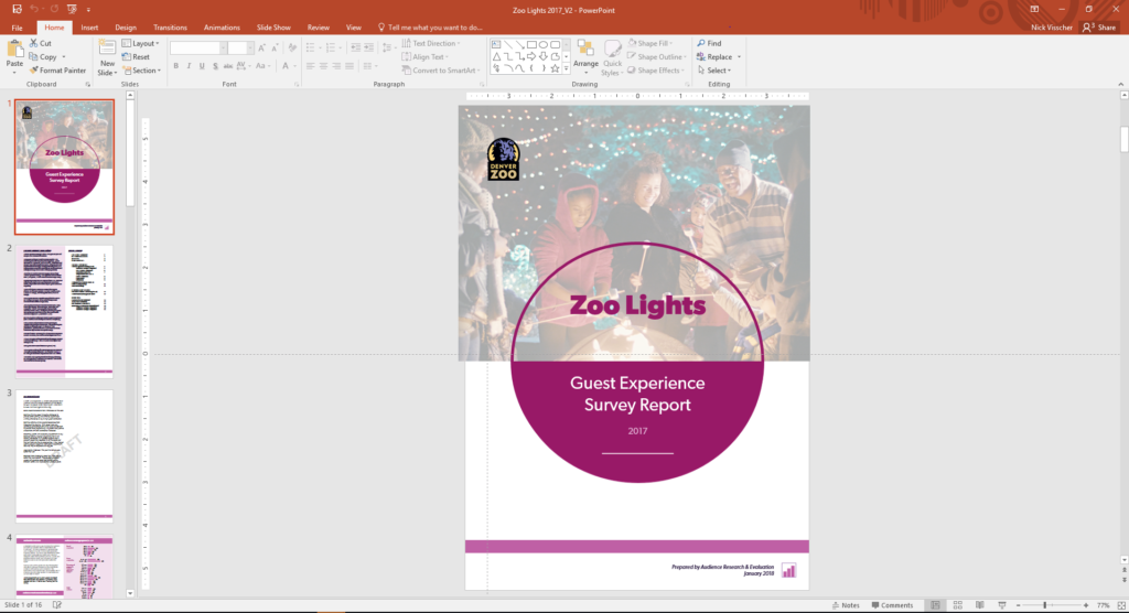
Have you tried writing your reports in PowerPoint instead of in Word? If so, please share your tips in the comments section below.
You Might Like
Soar beyond the dusty shelf report, how to copy/paste graphs from excel into word or powerpoint, report redesign.
- First Name *
Got any suggestions?
We want to hear from you! Send us a message and help improve Slidesgo
Top searches
Trending searches

memorial day
12 templates

66 templates

american history
75 templates

music video
21 templates

150 templates

Report Presentation templates
Let everyone in your company know about the status of a project, the balance sheets or a summary of the annual performance with these templates for reports. their infographics and graphs included will help you a lot.

It seems that you like this template!
News report podcast pitch deck.
Download the News Report Podcast Pitch Deck presentation for PowerPoint or Google Slides. Whether you're an entrepreneur looking for funding or a sales professional trying to close a deal, a great pitch deck can be the difference-maker that sets you apart from the competition. Let your talent shine out thanks...
How to Write a Formal Business Report
Download the "How to Write a Formal Business Report" presentation for PowerPoint or Google Slides. The world of business encompasses a lot of things! From reports to customer profiles, from brainstorming sessions to sales—there's always something to do or something to analyze. This customizable design, available for Google Slides and...
Social Media Report with Cycle Diagrams
Download the Social Media Report with Cycle Diagrams presentation for PowerPoint or Google Slides. How do you use social media platforms to achieve your business goals? If you need a thorough and professional tool to plan and keep track of your social media strategy, this fully customizable template is your...

Premium template
Unlock this template and gain unlimited access
Download the "CSR Report" presentation for PowerPoint or Google Slides. The world of business encompasses a lot of things! From reports to customer profiles, from brainstorming sessions to sales—there's always something to do or something to analyze. This customizable design, available for Google Slides and PowerPoint, is what you were...

Soft Marketing Report
Simplicity is sometimes the key to efficiency. With this marketing report template you will convey the phases of your campaign in an easy way and with a formal and professional tone. It's simple, interspersed with green and blue backgrounds, and geometric shapes that give it a modern touch. Use the...


Lip Filler Correction Case Report
Download the Lip Filler Correction Case Report presentation for PowerPoint or Google Slides. A clinical case is more than just a set of symptoms and a diagnosis. It is a unique story of a patient, their experiences, and their journey towards healing. Each case is an opportunity for healthcare professionals...

Colorful Book Report
Teach your students to create good book reports thanks to these colorful slides. They have a light background and on it we have created cards with orange, purple, blue, etc. colors. We have included different structures, and in them they can include the title of the book, the author, the...
News Report Writing Tips for Students
Download the News Report Writing Tips for Students presentation for PowerPoint or Google Slides. The education sector constantly demands dynamic and effective ways to present information. This template is created with that very purpose in mind. Offering the best resources, it allows educators or students to efficiently manage their presentations...
Social Media Report
Download the Social Media Report presentation for PowerPoint or Google Slides. How do you use social media platforms to achieve your business goals? If you need a thorough and professional tool to plan and keep track of your social media strategy, this fully customizable template is your ultimate solution. It...

Company Technical Report
Download the Company Technical Report presentation for PowerPoint or Google Slides. The world of business encompasses a lot of things! From reports to customer profiles, from brainstorming sessions to sales—there's always something to do or something to analyze. This customizable design, available for Google Slides and PowerPoint, is what you...

Internship Report
Download the "Internship Report" presentation for PowerPoint or Google Slides. The world of business encompasses a lot of things! From reports to customer profiles, from brainstorming sessions to sales—there's always something to do or something to analyze. This customizable design, available for Google Slides and PowerPoint, is what you were...
Business 2023 Annual Report Infographics
How did you company do during this year? Annalise your spendings, liabilities, earnings, profits, investments, etc. with this set of business infographics made for people who want to increase their productivity! They’re very easy to use and will help your company understand its achievements and its mistakes, to learn from...

Business Annual Report
Download the "Business Annual Report" presentation for PowerPoint or Google Slides. The world of business encompasses a lot of things! From reports to customer profiles, from brainstorming sessions to sales—there's always something to do or something to analyze. This customizable design, available for Google Slides and PowerPoint, is what you...

TV News Report: Digital Newsletter
Breaking news! A famous artist from Spain has declared to the press: "The rumors are right; I can't take this anymore." All viewers need to know about this! Thankfully, you work for a TV network, so it's going to appear in the next edition of the news. Oh, by the...

Companies are essential for a region’s economy, culture and society, and as such they should always contribute to the principles of sustainable development. Do you need to give a presentation about your CSR and want to do it with style? Let us help you.

SEO Monthly Report
Bring your SEO reports to life with this Slidesgo template. It is 100% editable and with it you can show the most relevant data of your SEO strategy. The graphs and tables will help you convey the information to your bosses or clients easily and quickly. It has a simple...

Modern Annual Report
All kinds of businesses depend on annual reports to quickly review what has been achieved during the year. Download this template and start editing the layouts so that you add the necessary data. Its minimalist design means you can go straight to the point. Graphs, infographics and mockups are also...

Internship Report Infographics
If you’re doing an internship, you probably need to write a report about it. After all, it’s interesting to gather all the information you have learned over the months and use it in the future. For a great report, we recommend infographics! They’re very visual and easy to use. Write...
- Page 1 of 7
Great presentations, faster
Slidesgo for Google Slides :
The easy way to wow

Register for free and start editing online

Data & Finance for Work & Life

Management Presentation: 8 Tips, Examples & a Template
In a corporate context, presenting works wonders for a career. Most professionals get exposure to presenting to informed colleagues and department managers. It’s an ideal way to get visibility and show value. But a management presentation to senior executives who aren’t familiar department nuances is a different ballgame.
A management presentation is a high-level summary to senior executive that optimizes reports to include only the details relevant to directorial decisions . They are notoriously difficult to navigate for two reasons: 1. most executives do not have working knowledge of the nuances in each department , 2. presenters rarely have time to understand executives’ preferences .
More than anything else, good management presenters learn how to strike a balance in the degree of detail: they provide enough detail so executives make informed decisions, but not so much detail that they cause confusion.
This article explores how to make a good management presentations in PowerPoint using 4 management presenting best practices , 4 management presenting techniques , providing examples for each, and finishing with a management presentation template you can apply in real life. You can use it as a jumping off point for deeper communication curriculum .
5 management presenting best practices are:
- Ask what managers prefer ahead of time.
- Have 1 message, and 1 message Only.
- The only words should be “Thought Starters.”
- Keep it short.
- Practice 7 times in advance.
4 management presenting techniques are:
- Use a CSP model – Challenge, Solution, Progress.
- Begin with a summary of exactly 3 points.
- Use only these 3 chart types: bar, line, scatter.
- Design slides with the company logo.
I will use a financial analyst perspective in this article, but everything here applies to data and business analysts as well.
Ask Executives Their Preference Ahead of Time
If you’ve ever taken a class on presentation techniques, you’ve heard the old adage “know your audience.” It’s true, the best way to deliver a great presentation is to align your message with what your audience already understands. The same applies to a management presentation.
The challenge is that, more often than not, executives are too busy for you to get to know them well. This means you hardly get the chance to understand how they like presentations. So what can you do? Well, ask them! There’s no harm in sending an email to understand better. And what’s more, once you know, you can always defer to their preferences in the future.
For a financial management presentation, common questions to ask include the following:
- Do you prefer to see raw data, or only visualizations?
- Do you prefer charts or table summaries?
- Would you like a written explanation on paper for each slide?
- Do you like averages alone, or do you prefer means, or standard deviation?
- What interests you most in a presentation?
If you gather some helpful insights, then your presentation will be that much better. That said, you may not get a response, or it may be quick and not insightful. But most senior executives will appreciate you asking .
The best part is you will be able to surprise them. Using the best practices and techniques below, in additional to any insights gathered form your email, will work wonders for you.
Have 1 Message, and 1 Message Only
The easiest mistake to make on a management presentation is trying to deliver multiple messages. Senior executives go through loads of meetings every day, and each meeting they have includes a wave of information. Your mission should be to deliver 1 essential message so they can easily understand and compartmentalize it.
This is no easy task. When I try to narrow down the focus of my management presentation message, it seems like I leave out critical information along the way. The key is to tell a story to incorporate critical information as part of a story towards the essential message.
For example, imagine you work for a wholesale watch company called Batch Watch . You want to explain a financing operation in which the company has the option of two loans to fund the initial costs of 10,000 watches. These loans have different interest rates and maturity dates. Loan A is better if the company expects to sell the watches within 3 months, while Loan B is better if the company expects to sell over more than 3 months. Each has cancellation fees and cash flow impacts.
Instead of showing the cancellation fees and cash flow impact of the each loan, all you need to say is “ we expect the company to sell them within 3 months, and we recommend loan A for that reason.” If the executives disagree on the sale timeline, they will ask for more information.
This is how you keep senior executives engaged, by integrating them in the story you tell. Ultimately, the essential message of your presentation should be how much profit the company will make from the watch funding operation. Senior executives should leave feeling like the project is in good hands with you, and they only feel that way when you tell a story around the essential message .
Whatever the Message, Use Data
Whatever message you want to send, it needs to be backed up by data. In the example above the data was financial, but it’s not always that simple. Context may require you to provide KPIs and perform extensive data analysis that culminates in a small output that your viewers can easily digest.
You need to be strong with data to deliver a good management presentation. To get started or refresh your memory, you can read AnalystAnswers’ free Intro to Data Analysis eBook .
The Only Words Should be “Thought Starters”
As a general presentation principle, you should not write many thoughts down on presentation slides. Words have two negative impacts on the audience: they demand energy from the reader, and they make the reader feel compelled to read, lest they misunderstand.
If you can avoid putting text blocks altogether, do. If you don’t need any writing at all, don’t. However, if you need guidance as you speak or want to provide reminders for a later data, use “Thought Starters.”
Thought starters are phrases of 3 words maximum that contain ideas leading to the essential message. People often call them “bullet points,” which is common for list-style thought starters. Personally, I prefer to place thought starters at different places on a slide. When I use a chart, for example, I put thought starters at relevant places on the slide.
Keep it Short
Your presentation should never consume more than 80% of the allotted timeframe. This means that if you plan a 5 minutes meeting, deliver the presentation in 4 minutes. If you’re given 30 minutes, do it in 25 minutes. If you have 1 hour, do it in 45 minutes.
By keeping the presentation short, you relieve the audience and you allow for some question buffer. Have you ever sat in a meeting planned for 1 hour, and at 45m it ends early? It’s a pleasure for everyone. Most of us feel like we’re running behind — when you put us ahead of schedule, we love you!
At the same time, senior executives may bombard you with questions throughout the presentation. If you planned to fill the whole timeframe, you won’t finish. But if you planned to finish early, you still have a chance.
And if you use the rest of these best practices and techniques, those senior executives shouldn’t need to ask too many questions!
Practice 7 Times in Advance
There’s a mix of opinions on the number of times you should rehearse a presentation before doing it live, but most people agree that it’s somewhere between 5 and 10 times. If you take nothing else from this article, take this. To deliver a good presentation, prepare excellent slides; to deliver a great presentation, practice presenting them 7 times.
To deliver a good presentation, prepare excellent slides; to deliver a great presentation, practice presenting them 7 times. AnalystAnswers.com
But just practicing isn’t enough, there are a few criteria you must meet:
- Practice in the room you will present in. There’s something about envisioning yourself live that really makes a difference. When you practice in a space other that where you’ll present, it’s good. But when you practice in the “live” room, you’re able to sensitize yourself to the environment, which calms nerves so you can focus on the message.
- Have an audience. We all behave differently when there’s stimulus of other people around. Whenever possible, get one or two people to whom you can present. In addition to getting used to having an audience, you’ll also get some feedback.
- Use the same volume of voice. When we’re not “live,” we have a tendency to hold back on our voice. This is detrimental to the presentation because you feel taken off guard by your own voice. Make sure to envision yourself in front of the senior execs when you practice.
Best Practices Recap
We’ve addressed 5 best practices — now let’s turn our attention to 4 specific techniques you can easily implement. And when you do, that work wonders for management presenting.
Use a CSP Model (Challenge, Solution, Progress)
Every presentation needs structure, but it’s easy to forget that we need to guide our audience. A great way to structure management reports is using the CSP model. CSP stands for Challenge, Solution, Progress, and it’s exactly what it sounds like.
You need to explain the challenge or goal, explain what the solution to the challenge is (or how to achieve the goal), and show where you are in the steps to completing that goal.
For example, let’s look at our Batch Watch case. Imagine you need to find funding for a new product launch — $100,000 to be exact. A sample CSP model for this would be a slide that shows:

By using the CSP model, you guide the audience. However, it’s important to note that the CSP model is not a summary . It’s an overview of the process, but a summary should always come before. Let’s talk about it now.
Begin with a Summary of Exactly 3 Points
Any good presentation begins with a summary. And a good summary communicates the essential message simply in 3 points. However, the summary is not the same thing as the CSP model. Instead, it provides an alternative view on the challenge and and solution.
For example, using our Batch Watch case of funding a new product, you could address a summary in the following way:
- Challenge, Solution, Progress
- Funding acquisition
- Project Timeline
This provides additional details that are most relevant to the project and carry added value to the CSP model.
Use only Bar Charts (aka Column Charts), Line Graphs, and Scatter Plots
Whether it’s for data, financial, and business analyst topics , management presentations should only ever have bar charts, line graphs, and scatter plots. They are common, rich in information, and well understood. Any other kind of graph is distracting more than anything else.
A bar graph is useful when you want to compare like variables. For example, if you want to show the average size of Canadian trout versus American trout. A common mistake, though, is to use bar graphs to show change over time. While it’s not incorrect to do so, line graphs are better for this purpose.
A line graph is useful when you want to show change in one variable over time (we call this time series data). For example, if you want to show the progression of revenues over time, line graphs are the perfect way to do so.
A scatter plot is best when you want to compare a set of observations of one variable to a set of observations of another. It’s the ideal way to quickly visualize the relationship between two variables. For example, if you want to see how company revenues compare to GDP, you could use a scatter plot like this:
For example, let’s look at our Batch Watch case. If we want to see how our company is performing compared to the economy as a whole, we could use this scatter plot. As you can see, we have a positive (bottom left to top right) relationship, but a weak one (points not clustered closely).

Design Slides Using the Company Logo
When you’re presenting to senior executives, you want your slides to look professional. The best way to do that is by putting your company logo on them, including any corporate design standards (colors, fonts, etc). Show through your presentation that you belong to the same company, and that you’re in it in spirit. For example, let’s add the AnalystAnswers.com logo to our CSP slide:

Techniques Recap
Here’s a sample management presentation template below. I hope you understand after reading this article that management presentation is more about your delivery than it is about the slides you prepare.
Download Management Presentation Template for Free
While the techniques we’ve discussed will help you build a good presentation, your success really depends on how well you deliver the ideas needed to help senior executives make decisions. At the end of the day, it’s all about balance.
If you only remember two things from this article, remember that great management presenters give enough detail to inform senior executive but not too much that they cause confusion, and great management presenters make sure they do so by practicing 7 times in advance. You’ll have to practice, practice, practice.
About the Author
Noah is the founder & Editor-in-Chief at AnalystAnswers. He is a transatlantic professional and entrepreneur with 5+ years of corporate finance and data analytics experience, as well as 3+ years in consumer financial products and business software. He started AnalystAnswers to provide aspiring professionals with accessible explanations of otherwise dense finance and data concepts. Noah believes everyone can benefit from an analytical mindset in growing digital world. When he's not busy at work, Noah likes to explore new European cities, exercise, and spend time with friends and family.
File available immediately.
Notice: JavaScript is required for this content.


Blog – Creative Presentations Ideas
infoDiagram visual slide examples, PowerPoint diagrams & icons , PPT tricks & guides
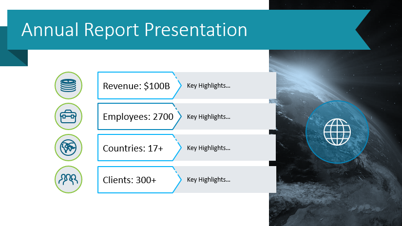
6 Examples of Presenting Business Highlights in Your Annual Report
Last Updated on April 25, 2024 by Anastasia
Need to share information about your company performance and create a comprehensive overview of activities throughout the preceding year? Financial data and key business highlights can contain lots of content and be quite heavy text-wise. Make your annual report easy to understand by using graphs, icons, infographic elements, and data-driven charts.
Annual reports are intended to give shareholders and other interested people information about the company’s operations and financial performance. Prepare that report smoothly using our pre-designed structured slides.
All slide examples presented below can be downloaded as an editable source. Click here to see the Annual Report Company Performance Presentation for PowerPoint .
Get inspired by our visualization examples, which show how you can present selected six business and financial highlights compellingly.
Present the company at a glance and illustrate business highlights in the annual report
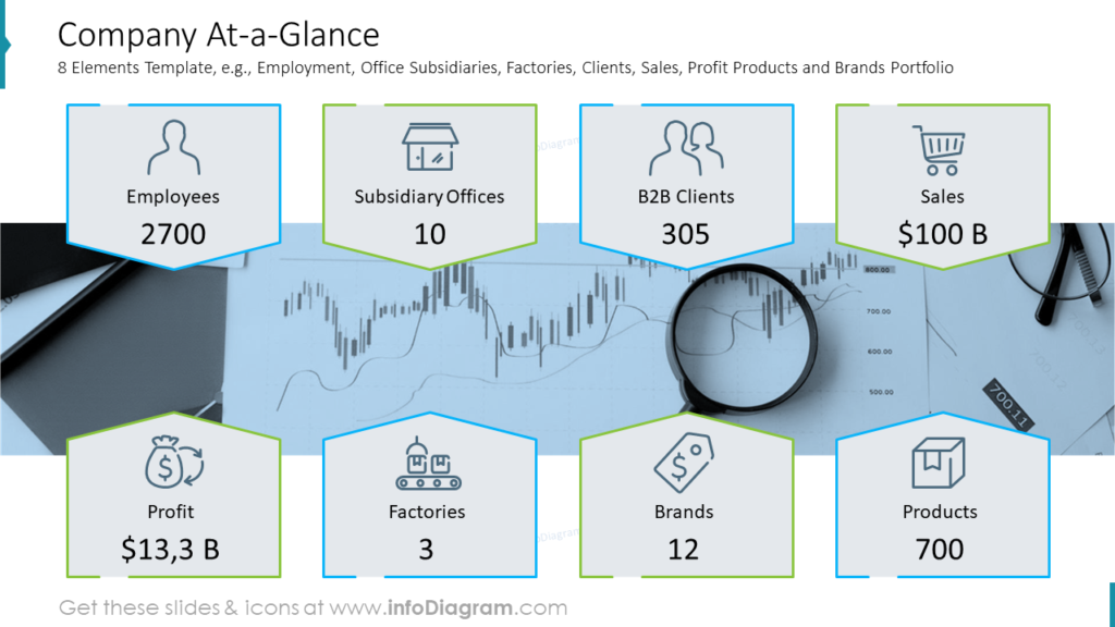
Start with outlining key company facts, like global presence, portfolio projects or clients, and satisfied customers. You can easily combine those facts with a shareholding structure pie chart and add a quote from the CEO if you’d like.
Alternatively, use another slide to show your company a glance. You can reuse this template, where we included such business highlights as employment, office subsidiaries, factories, clients, sales, profit products, and brand portfolios. Notice how each fact is illustrated with a symbol. We also added a neutral background picture, which makes this slide more attractive without stealing attention from the content.
Illustrate milestones in a roadmap
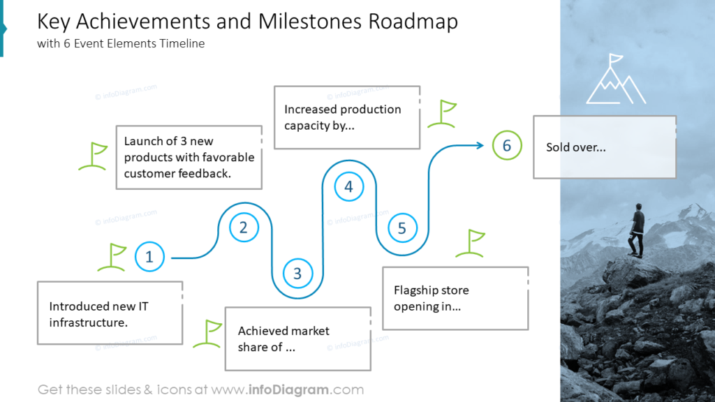
Choose the most essential events that influenced your company and show them using a timeline.
In the example above we illustrated six milestones: new IT infrastructure introduction, 3 new products with favorable customer feedback launch, market share achievement, production capacity increase, flagship store opening, and selling over. Each stage is shown with flags and there’s an icon of a mountain as a symbol of accomplishment at the last stage. You can optionally add an illustrative photo on the right or left side of the slide.
Include the top customers’ analysis in the business highlights of the annual report
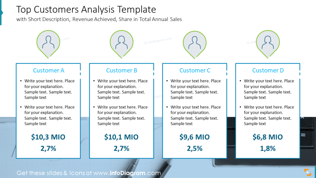
To recap your best customer profiles you can use a slide like above, containing a short description, revenue achieved, and share in total annual sales.
Focus your audience’s attention on figures. Consider increasing the font size and using a different color from other text.
Create revenue and profit snapshot
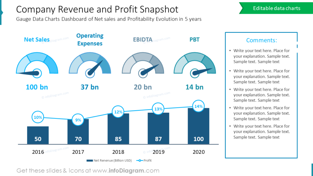
The company revenue and profit snapshot slide doesn’t have to be boring and contains lots of text information. We propose a creative way: use gauge data charts dashboard to describe net sales and profitability evolution in 5 years. We included the following indexes: Net Sales, Operating Expenses, EBIDTA, and PBT. You can reuse it to adapt to your needs.
If you look closer, this slide example includes much content, but it is designed in such a way that it’s easy to understand. You can also add your comments and observations aside.
Show next year’s outlook
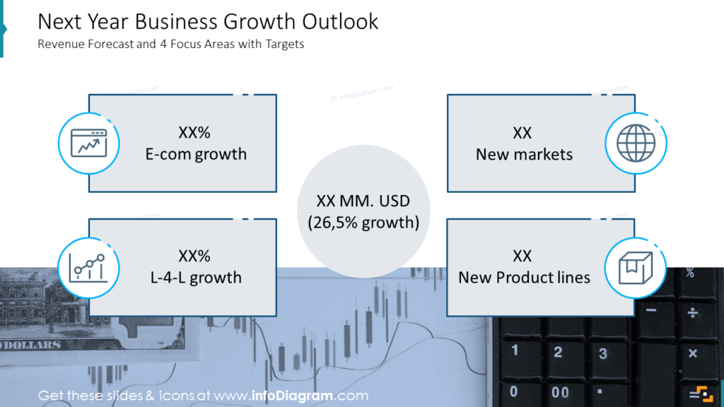
Illustrate your next year’s business growth outlook using a revenue forecast and 4 focus areas with targets slide. In our example, we focused on the following highlights: E-commerce growth, New Markets, L-4-L growth, and New Product Lines. Each point is illustrated with a suitable symbol. If you’d like to include more elements into the forecast, you better break it down into several slides, not to stuff one too much with the figures.
Create the balance sheet and cash flow statement readable
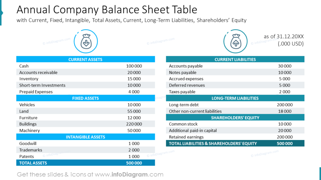
Such busy long tables usually don’t look good. Make a difference this time – try using such table templates with headers and icons. You can also include comments if needed. Current, Fixed, Intangible, Total Assets, Current, Long-Term Liabilities, and Shareholders’ Equity are the most common elements of the balance sheet, while cash flow from Operations, Investing, and Financing are a part of the cash flow statement.
Guide on how to visualize goals achievement summary slide
Check a quick instruction on how you can present a goals achievement summary as part of your business highlights using simple shapes, icons, and success/failure indications.
1. Replace table content with text in shapes.
A form of table is not the best visual format in this case. Using a PowerPoint shape looks better and is easier to edit, too.
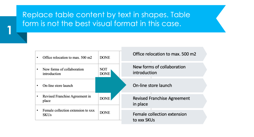
2. Enrich the list with status marks
It’s good to use a consistent set of icons expressing the goal’s achievement.
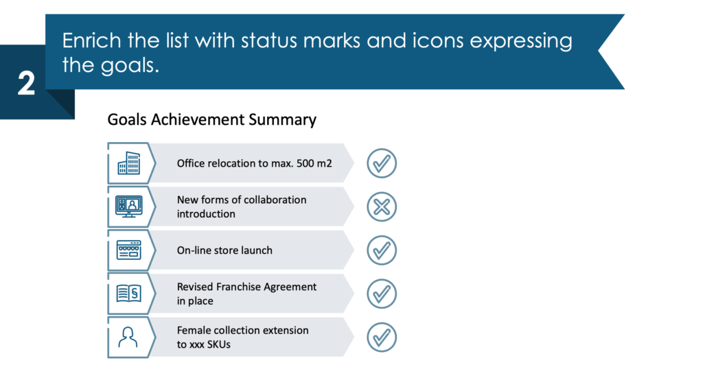
3. Create an area for comments.
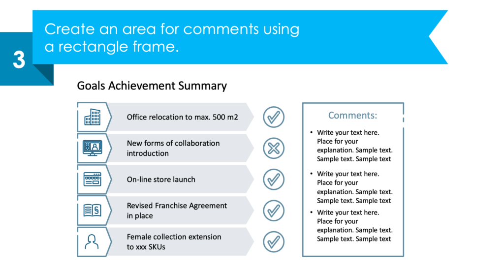
4. Make your infographic look attractive.
Add a background picture and color-coding supporting the meaning of Done and Not Done goals.
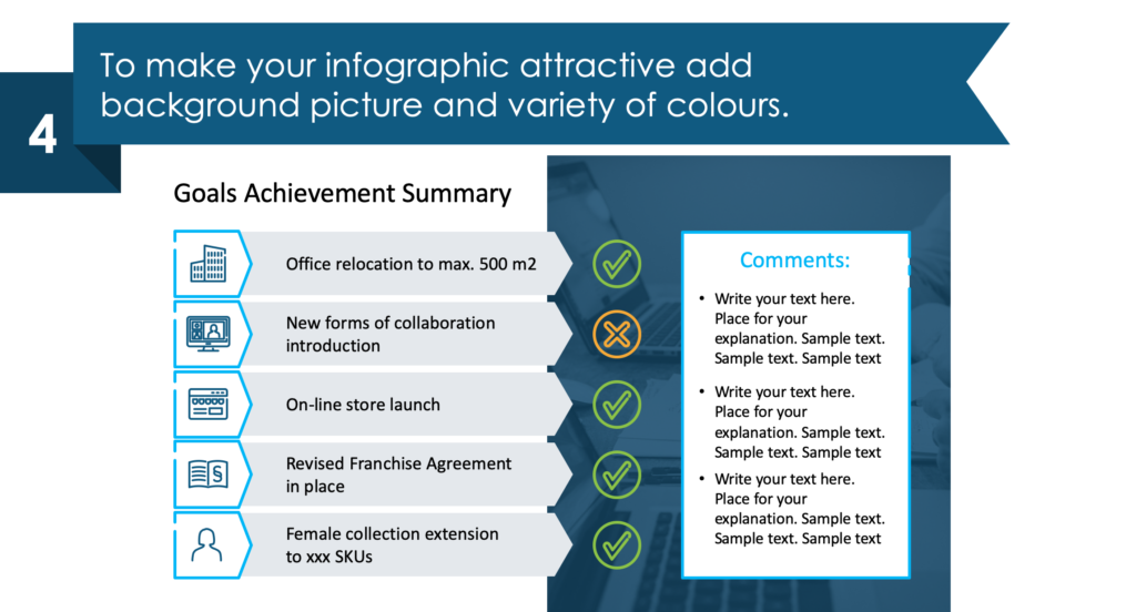
See the whole step-by-step guide and other examples here: How to Create an Effective Annual Report and Company Performance Presentation .
Resource: Annual Report Company Performance Presentation
The examples above are only a part of our annual report slide collection. Check our pre-designed annual report deck that incorporates key business highlights example layouts and financial data and present the data in a clear, informative, and visually appealing manner.
The majority of our slides have a space for your text/comments, so it is very easy to extend the presented ideas. We also included detailed instructions on how to alter the content, values, colors, and look and feel of our slides. See the full deck here:
Annual Report Company Performance PPT Presentation
More Design Inspiration
Check out our YouTube channel, where we share practical tips and before-after slide transformations like this:
If you need to focus only on the company’s stock performance and cover financial and sales information during your report, check our blog about visualizing stock financial annual report components.
Use modern graphics to create more consistent slides and communicate your ideas. Want to do even more customizing? Infographics from the collection of professionally designed editable diagram templates might help level up your PowerPoint presentations.
📩 Subscribe to the newsletter and follow our YouTube channel to get more design tips and slide inspiration.

Presentation vs Report Writing: What’s the Difference?
By: Author Shrot Katewa

I was sitting at my desk today while I stumbled upon a question by one of our patrons. It got me thinking if there was ever a difference between a Presentation and Report Writing? So, I did some research, and here’s what I found out!
The main difference between a Presentation and Report Writing is that a report is usually fairly extensive and gives a detailed account of the information on a particular topic. Whereas, a presentation is mostly a synopsis which highlights the key points that are important for the audience.
Since one of the key objectives of both – a presentation and a report is to give information to its intended audience, people often tend to confuse between the two. So, let’s understand the nuances in further detail.
Key Differences between Presentation and Report Writing
In order to make sure that we don’t end up creating an incorrect document the next we are tasked with an assignment, it is important for us to understand the differences between a presentation and report writing.
As I mentioned earlier, one of the purposes of both a presentation and a report is typically to provide insights or useful information about a certain topic.
However, the purpose of creating a presentation is to share information in a short period of time; usually not more than 15-20 minutes. Thus, it ends up being a synopsis of a topic rather than giving a detailed account on a particular topic.
Report Writing on the other hand goes into the intricacies involved within a particular topic.
For a research oriented report writing, the purpose of the report is often to capture the detailed account for the research conducted including (but not limited to) purpose of the research, methodology adopted for conducting research, observations and findings, discrepancies (if any), and the conclusion.
Writing a report often scientific approach and requires a technical understand of the subject.
2. Depth of Information
Another difference between a report and a presentation is the depth of information that is shared in the two types of documents.
As mentioned in the previous point, a report goes in great depth capturing the thought behind almost every single action taken by the researcher; thereby giving an in-depth understanding on the topic.
A presentation on the other hand picks up key pieces of information and aims to provide very specific details usually in the interest of the available time of the audience.
A typical example of a report would be a corporate annual report which explains the details of actions taken by the organisation and how it performed. This information is shared across multiple paragraphs usually accompanied by a table giving the performance details. Whereas, a presentation of the annual report only summarizes the key points on the performance of the company throughout the year.
3. Information Delivery

Another major difference between a presentation and report writing is the mode of information delivery.
Since a presentation is a piece of summarized information, it requires a person to share additional information while delivering the presentation. A presentation mostly contains visual cues along with a few points on each slide, which is accompanied with a talk given by an individual giving the presentation.
A presentation can be given in-person to a small group of people or even to a few hundred individuals in a large auditorium. Alternatively, a presentation can also be delivered online to several thousands of people across the globe using different softwares.
A report on the other hand doesn’t necessarily require to be presented. Since it contains detailed information, it can be independently read by people at their comfort.
Reading a report can take time as it is often spread across several hundreds of pages.
4. Method of Engaging the Audience
Yet another difference between a presentation and report writing is the manner in which it engages its audience.
A presentation depends upon the skill of the presenter to engage the audience. A person giving a presentation not only needs to make the presentation visually appealing, it also requires the presenter to entertain the audience by means of story-telling and humor (as deemed necessary) while delivering the presentation.
A report on the other hand depends on the capability of an individual to command a language to engage its readers. It needs the person writing a report to have a good grasp of the language in order to describe the information accurately and as briefly as possible while holding the interest of the audience.
In a research study done in order to compare the understanding capability of science students based information consumed in the two formats – Presentation versus Report format , it was observed that students understood the topic better when it was explained through a presentation rather than a report.
Perhaps, one can conclude that presentation is usually more engaging than a detailed report.
5. Skills Needed

Lastly, another difference between a presentation and report writing is the skills needed for each of the two activities.
Creating an effective presentation requires not only design skills, but also mastering the art of giving presentations! While the task of designing a presentation can often be outsourced, the knack of picking the correct topics to be covered in the presentation can’t be outsourced and is dependent on the presenter.
As a presenter, you don’t necessarily need to have great writing skills, but you surely need to know the art of story-telling, and leverage this for giving a presentation.
On the other hand, report writing requires creative (sometimes technical) writing skills. One also needs to be analytical.
How to Choose between a Presentation and a Report? Which is Better?
Choosing between creating a presentation or writing a report can be a difficult task for some. But, not being able to do so correctly can often lead to drastic (sometimes even embarrassing) circumstances.
Here are a few questions that you should ask yourself before starting creating a presentation or writing a report –
- How much time do I have with my audience? If you have only about 20 to 30 minutes with you audience to share the required information, it is perhaps better to give a presentation than to write a report. A report (unless written in less than 10 pages), will usually take more than this much time to be completely understood.
- Does your intended audience prefer to read or to hear/watch? People have their own preferences when it comes to consuming information. Some people like to read, while others prefer hearing or visual comprehension to gain knowledge. Be sure to ask them their preference, and make your decision accordingly.
- What are you good at – Presentation or Report Writing? If the above two questions are not important or if your audience doesn’t have a preference, a good way to start would be to focus on your strengths. Ask yourself – what are you more comfortable with? Is a creating and delivering a presentation? Or, is it writing a report? Make a decision based on your capability. A little introspection can definitely go a long way in helping you choose the right direction.
How to Create an Attractive Presentation?
If you end up deciding to go down the presentation route, then we’ve got you covered.
The main objective of this site is to help you create better presentations!
Thus, be sure to check out a few other posts on this website that provide little ninja tips on how you can make your presentations attractive in a few easy steps!
A good place to start would be by reading this post –
7 EASY tips that ALWAYS make your PPT presentation attractive (even for beginners)
Don’t hesitate to reach out to us if you have any specific questions. We would love to help you create better presentations!
Final Thoughts
As we understood in this article, even though delivering a presentation and report writing have a similar objective of sharing interesting information, they both have their differences.
Knowing what mode of information sharing to choose can often be critical. Thus, I hope this post has helped you understand some of the key differences between the two and how to choose whether to create a presentation or write a report.

AI Presentation Generator
AI Presentation Maker
AI Image Generator
WORD to PPT
Convert to PPT
Convert Reports to PPT with AI
Summarize a Report into a PowerPoint Presentation for quick and easy understanding
Select and upload a Report that needs to be summarized for a presentation.
Choose from a variety of presentation template styles and select the one that best represents your content.
Relax and Watch the Magic Happen. Sit back and let AI do the heavy lifting for you! Get a customized design and stunning presentation filled with informative and professional content.
You can then edit the presentation using your preferred application, such as MS PowerPoint or Google Slides, or with our online AI Presentation Maker.
Superfast presentation creation
Join 500K professionals & educators
✓ Create with AI ✓ Convert to PPT with AI ✓ Compatible with PowerPoint ✓ Built in templates ✓ Auto Layout

We use essential cookies to make Venngage work. By clicking “Accept All Cookies”, you agree to the storing of cookies on your device to enhance site navigation, analyze site usage, and assist in our marketing efforts.
Manage Cookies
Cookies and similar technologies collect certain information about how you’re using our website. Some of them are essential, and without them you wouldn’t be able to use Venngage. But others are optional, and you get to choose whether we use them or not.
Strictly Necessary Cookies
These cookies are always on, as they’re essential for making Venngage work, and making it safe. Without these cookies, services you’ve asked for can’t be provided.
Show cookie providers
- Google Login
Functionality Cookies
These cookies help us provide enhanced functionality and personalisation, and remember your settings. They may be set by us or by third party providers.
Performance Cookies
These cookies help us analyze how many people are using Venngage, where they come from and how they're using it. If you opt out of these cookies, we can’t get feedback to make Venngage better for you and all our users.
- Google Analytics
Targeting Cookies
These cookies are set by our advertising partners to track your activity and show you relevant Venngage ads on other sites as you browse the internet.
- Google Tag Manager
- Infographics
- Daily Infographics
- Popular Templates
- Accessibility
- Graphic Design
- Graphs and Charts
- Data Visualization
- Human Resources
- Beginner Guides
Blog Business How to Present a Case Study like a Pro (With Examples)
How to Present a Case Study like a Pro (With Examples)
Written by: Danesh Ramuthi Sep 07, 2023

Okay, let’s get real: case studies can be kinda snooze-worthy. But guess what? They don’t have to be!
In this article, I will cover every element that transforms a mere report into a compelling case study, from selecting the right metrics to using persuasive narrative techniques.
And if you’re feeling a little lost, don’t worry! There are cool tools like Venngage’s Case Study Creator to help you whip up something awesome, even if you’re short on time. Plus, the pre-designed case study templates are like instant polish because let’s be honest, everyone loves a shortcut.
Click to jump ahead:
What is a case study presentation?
What is the purpose of presenting a case study, how to structure a case study presentation, how long should a case study presentation be, 5 case study presentation examples with templates, 6 tips for delivering an effective case study presentation, 5 common mistakes to avoid in a case study presentation, how to present a case study faqs.
A case study presentation involves a comprehensive examination of a specific subject, which could range from an individual, group, location, event, organization or phenomenon.
They’re like puzzles you get to solve with the audience, all while making you think outside the box.
Unlike a basic report or whitepaper, the purpose of a case study presentation is to stimulate critical thinking among the viewers.
The primary objective of a case study is to provide an extensive and profound comprehension of the chosen topic. You don’t just throw numbers at your audience. You use examples and real-life cases to make you think and see things from different angles.
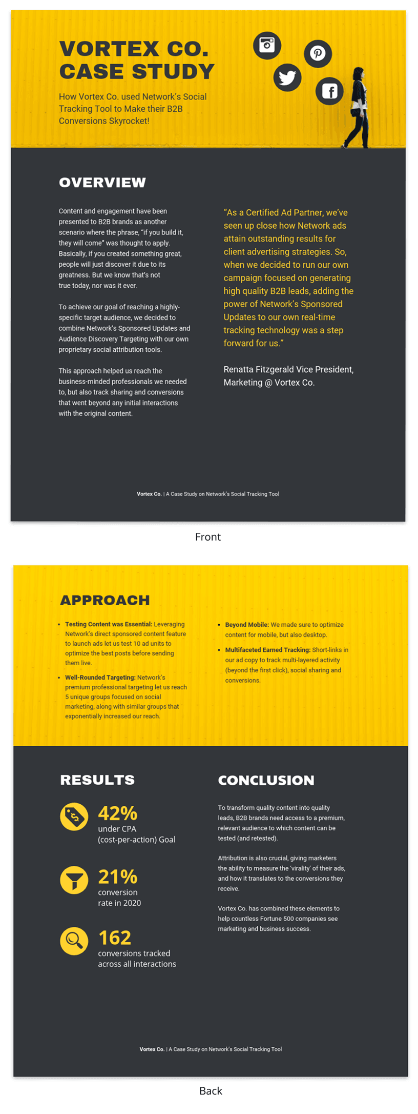
The primary purpose of presenting a case study is to offer a comprehensive, evidence-based argument that informs, persuades and engages your audience.
Here’s the juicy part: presenting that case study can be your secret weapon. Whether you’re pitching a groundbreaking idea to a room full of suits or trying to impress your professor with your A-game, a well-crafted case study can be the magic dust that sprinkles brilliance over your words.
Think of it like digging into a puzzle you can’t quite crack . A case study lets you explore every piece, turn it over and see how it fits together. This close-up look helps you understand the whole picture, not just a blurry snapshot.
It’s also your chance to showcase how you analyze things, step by step, until you reach a conclusion. It’s all about being open and honest about how you got there.
Besides, presenting a case study gives you an opportunity to connect data and real-world scenarios in a compelling narrative. It helps to make your argument more relatable and accessible, increasing its impact on your audience.
One of the contexts where case studies can be very helpful is during the job interview. In some job interviews, you as candidates may be asked to present a case study as part of the selection process.
Having a case study presentation prepared allows the candidate to demonstrate their ability to understand complex issues, formulate strategies and communicate their ideas effectively.
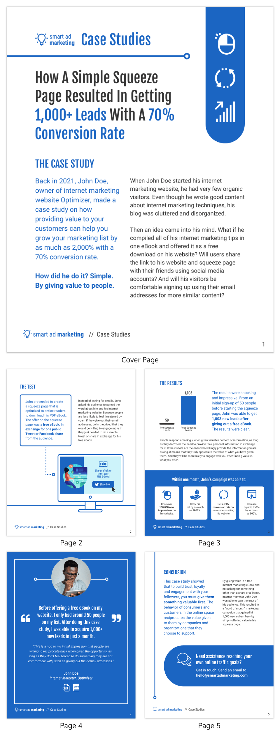
The way you present a case study can make all the difference in how it’s received. A well-structured presentation not only holds the attention of your audience but also ensures that your key points are communicated clearly and effectively.
In this section, let’s go through the key steps that’ll help you structure your case study presentation for maximum impact.
Let’s get into it.
Open with an introductory overview
Start by introducing the subject of your case study and its relevance. Explain why this case study is important and who would benefit from the insights gained. This is your opportunity to grab your audience’s attention.
Explain the problem in question
Dive into the problem or challenge that the case study focuses on. Provide enough background information for the audience to understand the issue. If possible, quantify the problem using data or metrics to show the magnitude or severity.
Detail the solutions to solve the problem
After outlining the problem, describe the steps taken to find a solution. This could include the methodology, any experiments or tests performed and the options that were considered. Make sure to elaborate on why the final solution was chosen over the others.
Key stakeholders Involved
Talk about the individuals, groups or organizations that were directly impacted by or involved in the problem and its solution.
Stakeholders may experience a range of outcomes—some may benefit, while others could face setbacks.
For example, in a business transformation case study, employees could face job relocations or changes in work culture, while shareholders might be looking at potential gains or losses.
Discuss the key results & outcomes
Discuss the results of implementing the solution. Use data and metrics to back up your statements. Did the solution meet its objectives? What impact did it have on the stakeholders? Be honest about any setbacks or areas for improvement as well.
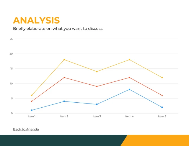
Include visuals to support your analysis
Visual aids can be incredibly effective in helping your audience grasp complex issues. Utilize charts, graphs, images or video clips to supplement your points. Make sure to explain each visual and how it contributes to your overall argument.
Pie charts illustrate the proportion of different components within a whole, useful for visualizing market share, budget allocation or user demographics.
This is particularly useful especially if you’re displaying survey results in your case study presentation.
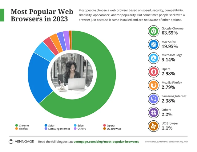
Stacked charts on the other hand are perfect for visualizing composition and trends. This is great for analyzing things like customer demographics, product breakdowns or budget allocation in your case study.
Consider this example of a stacked bar chart template. It provides a straightforward summary of the top-selling cake flavors across various locations, offering a quick and comprehensive view of the data.
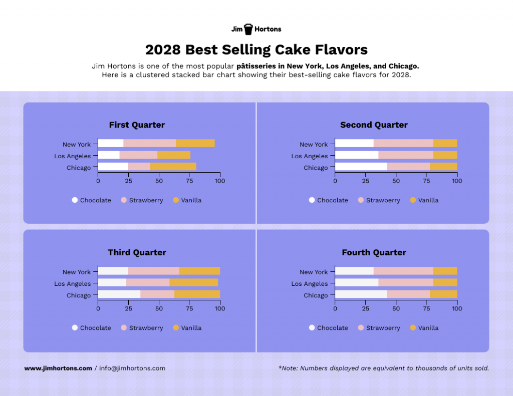
Not the chart you’re looking for? Browse Venngage’s gallery of chart templates to find the perfect one that’ll captivate your audience and level up your data storytelling.
Recommendations and next steps
Wrap up by providing recommendations based on the case study findings. Outline the next steps that stakeholders should take to either expand on the success of the project or address any remaining challenges.
Acknowledgments and references
Thank the people who contributed to the case study and helped in the problem-solving process. Cite any external resources, reports or data sets that contributed to your analysis.
Feedback & Q&A session
Open the floor for questions and feedback from your audience. This allows for further discussion and can provide additional insights that may not have been considered previously.
Closing remarks
Conclude the presentation by summarizing the key points and emphasizing the takeaways. Thank your audience for their time and participation and express your willingness to engage in further discussions or collaborations on the subject.
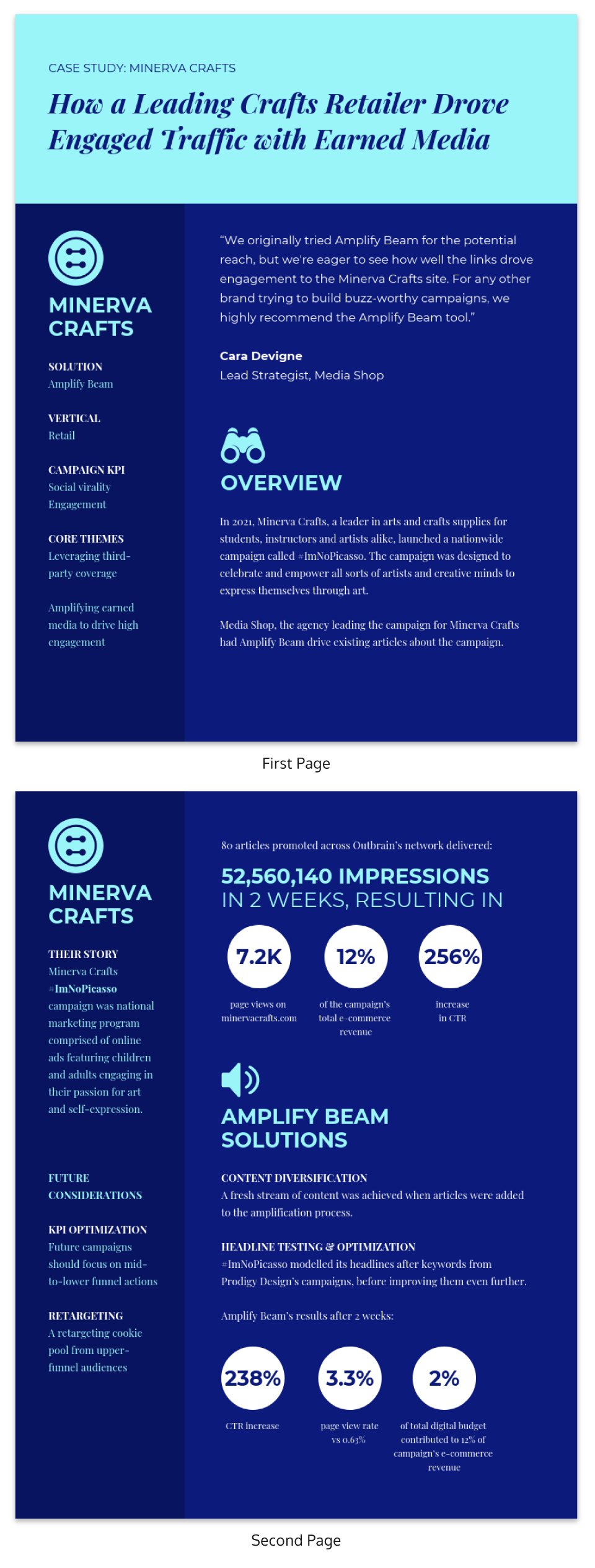
Well, the length of a case study presentation can vary depending on the complexity of the topic and the needs of your audience. However, a typical business or academic presentation often lasts between 15 to 30 minutes.
This time frame usually allows for a thorough explanation of the case while maintaining audience engagement. However, always consider leaving a few minutes at the end for a Q&A session to address any questions or clarify points made during the presentation.
When it comes to presenting a compelling case study, having a well-structured template can be a game-changer.
It helps you organize your thoughts, data and findings in a coherent and visually pleasing manner.
Not all case studies are created equal and different scenarios require distinct approaches for maximum impact.
To save you time and effort, I have curated a list of 5 versatile case study presentation templates, each designed for specific needs and audiences.
Here are some best case study presentation examples that showcase effective strategies for engaging your audience and conveying complex information clearly.
1 . Lab report case study template
Ever feel like your research gets lost in a world of endless numbers and jargon? Lab case studies are your way out!
Think of it as building a bridge between your cool experiment and everyone else. It’s more than just reporting results – it’s explaining the “why” and “how” in a way that grabs attention and makes sense.
This lap report template acts as a blueprint for your report, guiding you through each essential section (introduction, methods, results, etc.) in a logical order.

Want to present your research like a pro? Browse our research presentation template gallery for creative inspiration!
2. Product case study template
It’s time you ditch those boring slideshows and bullet points because I’ve got a better way to win over clients: product case study templates.
Instead of just listing features and benefits, you get to create a clear and concise story that shows potential clients exactly what your product can do for them. It’s like painting a picture they can easily visualize, helping them understand the value your product brings to the table.
Grab the template below, fill in the details, and watch as your product’s impact comes to life!

3. Content marketing case study template
In digital marketing, showcasing your accomplishments is as vital as achieving them.
A well-crafted case study not only acts as a testament to your successes but can also serve as an instructional tool for others.
With this coral content marketing case study template—a perfect blend of vibrant design and structured documentation, you can narrate your marketing triumphs effectively.
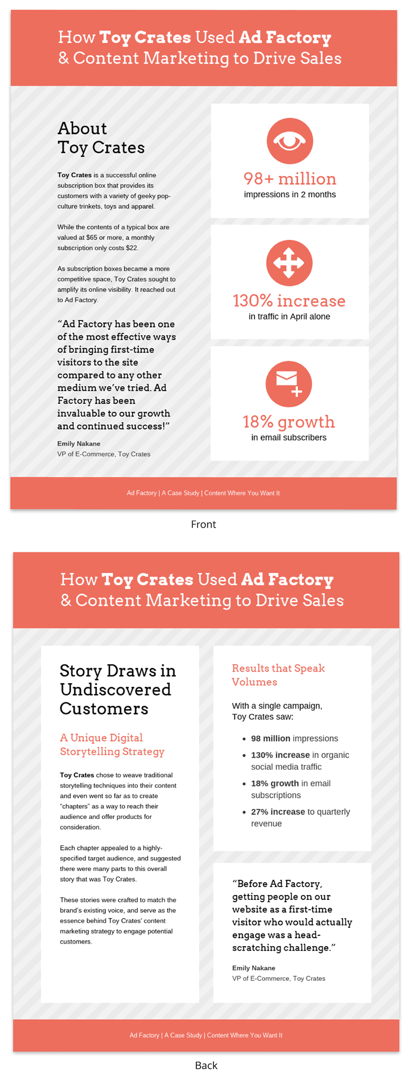
4. Case study psychology template
Understanding how people tick is one of psychology’s biggest quests and case studies are like magnifying glasses for the mind. They offer in-depth looks at real-life behaviors, emotions and thought processes, revealing fascinating insights into what makes us human.
Writing a top-notch case study, though, can be a challenge. It requires careful organization, clear presentation and meticulous attention to detail. That’s where a good case study psychology template comes in handy.
Think of it as a helpful guide, taking care of formatting and structure while you focus on the juicy content. No more wrestling with layouts or margins – just pour your research magic into crafting a compelling narrative.
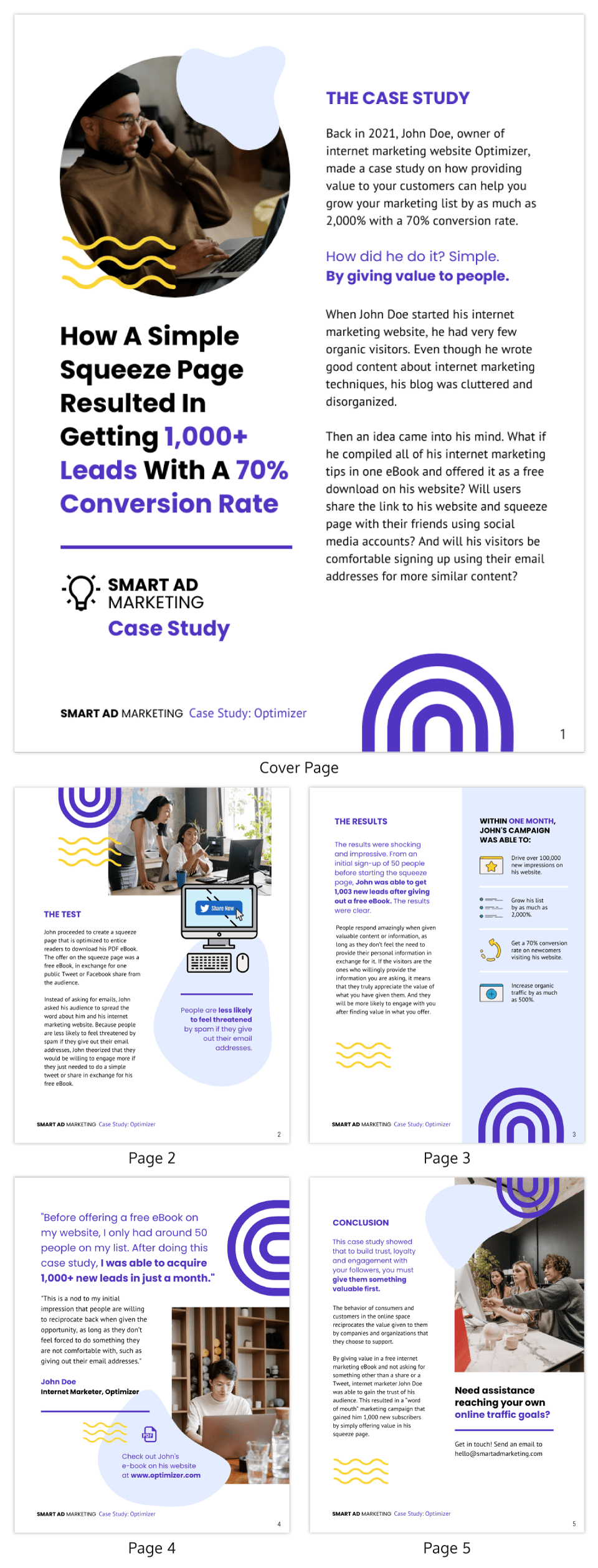
5. Lead generation case study template
Lead generation can be a real head-scratcher. But here’s a little help: a lead generation case study.
Think of it like a friendly handshake and a confident resume all rolled into one. It’s your chance to showcase your expertise, share real-world successes and offer valuable insights. Potential clients get to see your track record, understand your approach and decide if you’re the right fit.
No need to start from scratch, though. This lead generation case study template guides you step-by-step through crafting a clear, compelling narrative that highlights your wins and offers actionable tips for others. Fill in the gaps with your specific data and strategies, and voilà! You’ve got a powerful tool to attract new customers.
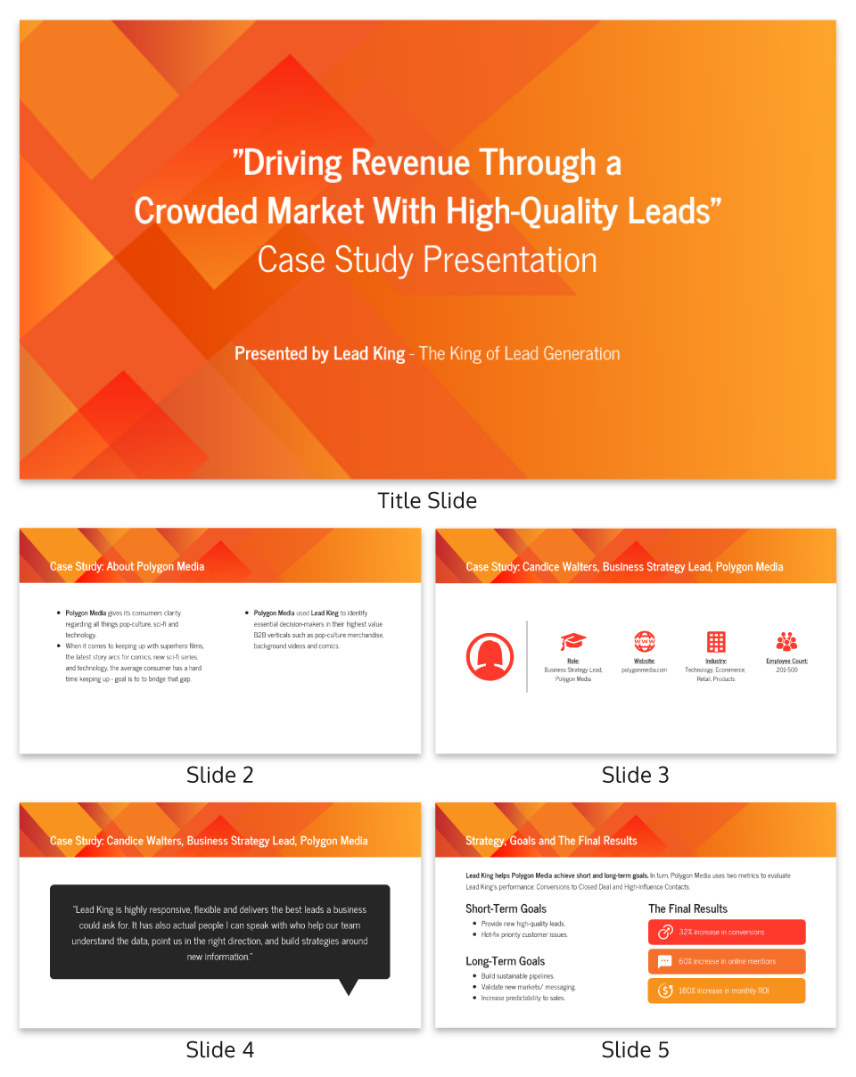
Related: 15+ Professional Case Study Examples [Design Tips + Templates]
So, you’ve spent hours crafting the perfect case study and are now tasked with presenting it. Crafting the case study is only half the battle; delivering it effectively is equally important.
Whether you’re facing a room of executives, academics or potential clients, how you present your findings can make a significant difference in how your work is received.
Forget boring reports and snooze-inducing presentations! Let’s make your case study sing. Here are some key pointers to turn information into an engaging and persuasive performance:
- Know your audience : Tailor your presentation to the knowledge level and interests of your audience. Remember to use language and examples that resonate with them.
- Rehearse : Rehearsing your case study presentation is the key to a smooth delivery and for ensuring that you stay within the allotted time. Practice helps you fine-tune your pacing, hone your speaking skills with good word pronunciations and become comfortable with the material, leading to a more confident, conversational and effective presentation.
- Start strong : Open with a compelling introduction that grabs your audience’s attention. You might want to use an interesting statistic, a provocative question or a brief story that sets the stage for your case study.
- Be clear and concise : Avoid jargon and overly complex sentences. Get to the point quickly and stay focused on your objectives.
- Use visual aids : Incorporate slides with graphics, charts or videos to supplement your verbal presentation. Make sure they are easy to read and understand.
- Tell a story : Use storytelling techniques to make the case study more engaging. A well-told narrative can help you make complex data more relatable and easier to digest.
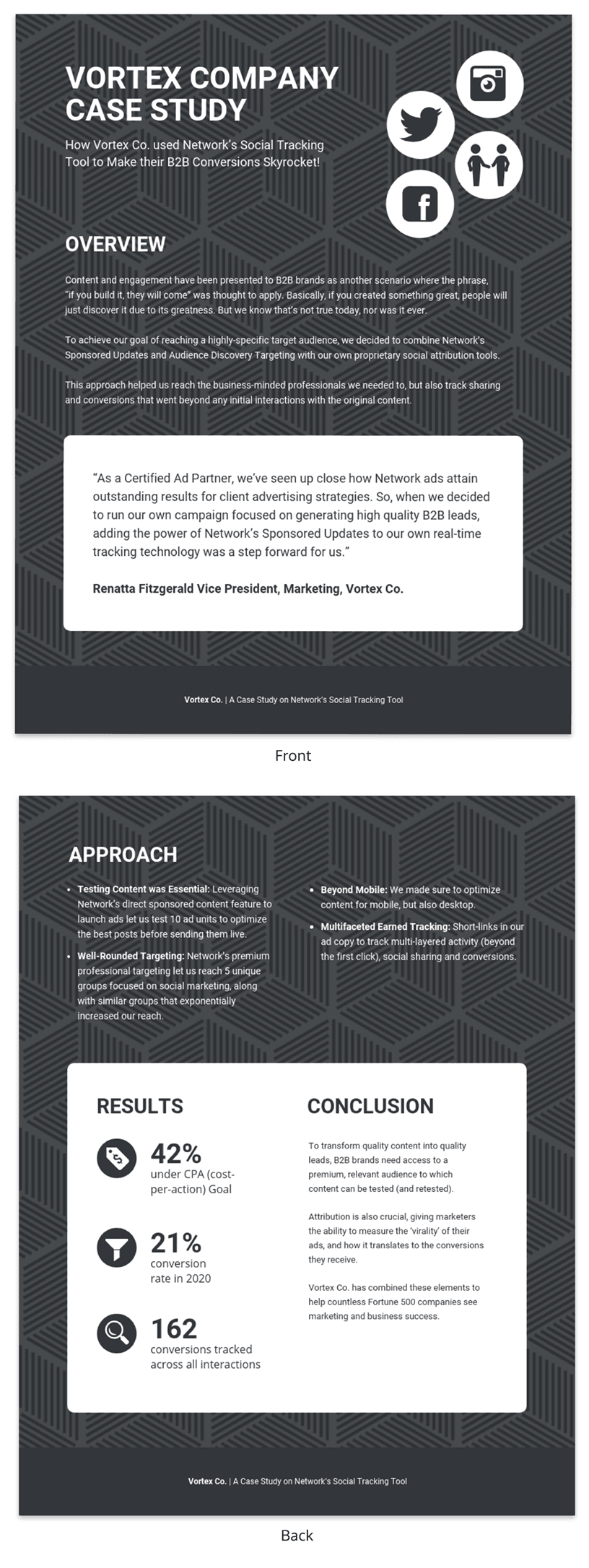
Ditching the dry reports and slide decks? Venngage’s case study templates let you wow customers with your solutions and gain insights to improve your business plan. Pre-built templates, visual magic and customer captivation – all just a click away. Go tell your story and watch them say “wow!”
Nailed your case study, but want to make your presentation even stronger? Avoid these common mistakes to ensure your audience gets the most out of it:
Overloading with information
A case study is not an encyclopedia. Overloading your presentation with excessive data, text or jargon can make it cumbersome and difficult for the audience to digest the key points. Stick to what’s essential and impactful. Need help making your data clear and impactful? Our data presentation templates can help! Find clear and engaging visuals to showcase your findings.
Lack of structure
Jumping haphazardly between points or topics can confuse your audience. A well-structured presentation, with a logical flow from introduction to conclusion, is crucial for effective communication.
Ignoring the audience
Different audiences have different needs and levels of understanding. Failing to adapt your presentation to your audience can result in a disconnect and a less impactful presentation.
Poor visual elements
While content is king, poor design or lack of visual elements can make your case study dull or hard to follow. Make sure you use high-quality images, graphs and other visual aids to support your narrative.
Not focusing on results
A case study aims to showcase a problem and its solution, but what most people care about are the results. Failing to highlight or adequately explain the outcomes can make your presentation fall flat.
How to start a case study presentation?
Starting a case study presentation effectively involves a few key steps:
- Grab attention : Open with a hook—an intriguing statistic, a provocative question or a compelling visual—to engage your audience from the get-go.
- Set the stage : Briefly introduce the subject, context and relevance of the case study to give your audience an idea of what to expect.
- Outline objectives : Clearly state what the case study aims to achieve. Are you solving a problem, proving a point or showcasing a success?
- Agenda : Give a quick outline of the key sections or topics you’ll cover to help the audience follow along.
- Set expectations : Let your audience know what you want them to take away from the presentation, whether it’s knowledge, inspiration or a call to action.
How to present a case study on PowerPoint and on Google Slides?
Presenting a case study on PowerPoint and Google Slides involves a structured approach for clarity and impact using presentation slides :
- Title slide : Start with a title slide that includes the name of the case study, your name and any relevant institutional affiliations.
- Introduction : Follow with a slide that outlines the problem or situation your case study addresses. Include a hook to engage the audience.
- Objectives : Clearly state the goals of the case study in a dedicated slide.
- Findings : Use charts, graphs and bullet points to present your findings succinctly.
- Analysis : Discuss what the findings mean, drawing on supporting data or secondary research as necessary.
- Conclusion : Summarize key takeaways and results.
- Q&A : End with a slide inviting questions from the audience.
What’s the role of analysis in a case study presentation?
The role of analysis in a case study presentation is to interpret the data and findings, providing context and meaning to them.
It helps your audience understand the implications of the case study, connects the dots between the problem and the solution and may offer recommendations for future action.
Is it important to include real data and results in the presentation?
Yes, including real data and results in a case study presentation is crucial to show experience, credibility and impact. Authentic data lends weight to your findings and conclusions, enabling the audience to trust your analysis and take your recommendations more seriously
How do I conclude a case study presentation effectively?
To conclude a case study presentation effectively, summarize the key findings, insights and recommendations in a clear and concise manner.
End with a strong call-to-action or a thought-provoking question to leave a lasting impression on your audience.
What’s the best way to showcase data in a case study presentation ?
The best way to showcase data in a case study presentation is through visual aids like charts, graphs and infographics which make complex information easily digestible, engaging and creative.
Don’t just report results, visualize them! This template for example lets you transform your social media case study into a captivating infographic that sparks conversation.

Choose the type of visual that best represents the data you’re showing; for example, use bar charts for comparisons or pie charts for parts of a whole.
Ensure that the visuals are high-quality and clearly labeled, so the audience can quickly grasp the key points.
Keep the design consistent and simple, avoiding clutter or overly complex visuals that could distract from the message.
Choose a template that perfectly suits your case study where you can utilize different visual aids for maximum impact.
Need more inspiration on how to turn numbers into impact with the help of infographics? Our ready-to-use infographic templates take the guesswork out of creating visual impact for your case studies with just a few clicks.
Related: 10+ Case Study Infographic Templates That Convert
Congrats on mastering the art of compelling case study presentations! This guide has equipped you with all the essentials, from structure and nuances to avoiding common pitfalls. You’re ready to impress any audience, whether in the boardroom, the classroom or beyond.
And remember, you’re not alone in this journey. Venngage’s Case Study Creator is your trusty companion, ready to elevate your presentations from ordinary to extraordinary. So, let your confidence shine, leverage your newly acquired skills and prepare to deliver presentations that truly resonate.
Go forth and make a lasting impact!
Discover popular designs

Infographic maker

Brochure maker

White paper online

Newsletter creator

Flyer maker

Timeline maker

Letterhead maker

Mind map maker

Ebook maker
Create an account
Create a free IEA account to download our reports or subcribe to a paid service.
Global Critical Minerals Outlook 2024

This report is part of Critical Minerals
About this report
Critical minerals, which are essential for a range of clean energy technologies, have risen up the policy agenda in recent years due to increasing demand, volatile price movements, supply chain bottlenecks and geopolitical concerns. The dynamic nature of the market necessitates greater transparency and reliable information to facilitate informed decision-making, as underscored by the request from Group of Seven (G7) ministers for the IEA to produce medium- and long-term outlooks for critical minerals.
The Global Critical Minerals Outlook 2024 follows the IEA’s inaugural review of the market last year. It provides a snapshot of industry developments in 2023 and early 2024 and offers medium- and long-term outlooks for the demand and supply of key energy transition minerals based on the latest technology and policy trends.
The report also assesses key risks to the reliability, sustainability and diversity of critical mineral supply chains and analyses the consequences for policy and industry stakeholders. It will be accompanied by an updated version of the Critical Minerals Data Explorer , an interactive online tool that allows users to explore the latest IEA projections.
Online table of contents
1.0 executive summary.
Read online
2.0 Market review
3.0 outlook for key minerals, outlook for key energy transition minerals.
This report provides an outlook for demand and supply for key energy transition minerals including copper, lithium, nickel, cobalt, graphite and rare earth elements. Demand projections encompass both clean energy applications and other uses, focusing on the three IEA Scenarios – the Stated Policies Scenario (STEPS), the Announced Pledges Scenario (APS) and the Net Zero Emissions by 2050 (NZE) Scenario. Supply projections are based on a detailed review of all announced projects. They show how today's geographical concentration evolves over time, for both mining and refining and how expected supply compares with primary supply requirements in climate-driven scenarios. The outlook is complemented by structured “clean energy transitions risk assessments” across four major dimensions – supply risks, geopolitical risks, ability to respond to supply disruptions, and exposure to ESG and climate risks, which were designed to help policymakers identify potential areas of weakness for each material.
Critical Minerals Data Explorer
Global demand projections for 37 critical minerals needed for clean energy transitions across the three main IEA scenarios and 11 technology-specific cases.
Previous editions
Cite report.
IEA (2024), Global Critical Minerals Outlook 2024 , IEA, Paris https://www.iea.org/reports/global-critical-minerals-outlook-2024, Licence: CC BY 4.0
Share this report
- Share on Twitter Twitter
- Share on Facebook Facebook
- Share on LinkedIn LinkedIn
- Share on Email Email
- Share on Print Print
Subscription successful
Thank you for subscribing. You can unsubscribe at any time by clicking the link at the bottom of any IEA newsletter.
site categories
Hollywood & media deaths in 2024: photo gallery & obituaries, breaking news.
- Nicki Minaj’s Show In England Postponed Following Arrest; Singer Released From Custody, Report
By Armando Tinoco
Armando Tinoco
Night & Weekend Editor
More Stories By Armando
- Tanya Sumner Dies: Former News Anchor At Indianapolis ABC Affiliate WRTV Was 53
- Rahul Kohli Talks Losing ‘Fantastic Four’ Role Of Reed Richards

Nicki Minaj ‘s show in Manchester, England, was postponed after the singer was arrested at Amsterdam’s Schiphol Airport on suspicion of carrying marijuana.
Minaj was scheduled to stop at the Co-op Live arena for her Pink Friday 2 World Tour . The Barbz were let into the venue, and later, a message from the loudspeakers confirmed that the concert would not occur.
Related Stories

Nicki Minaj Placed Under Arrest In The Netherlands

BET Awards Nominations: Drake & Nicki Minaj Lead The Field
The venue informed concertgoers their tickets would remain valid for the rescheduled performance “which will be announced” soon.
Pink Friday 2 World Tour Update pic.twitter.com/IOhOcS73pT — Co-op Live (@TheCoopLive) May 25, 2024
According to a statement from the Dutch police to Sky News , Minaj was released from custody and would have to pay an undisclosed fine for “illegally exporting soft drugs from the Netherlands to another country.”
The rapper documented her detention on social media and shared, “They’ve been trying to stop me from coming to every show. They took my bags before I could see them. Put it on the plane. Now saying they’re waiting on customs. This is what it looks like when ppl are paid big money to try to sabotage a tour after all else failed. Everything they’ve done is illegal.”
pic.twitter.com/h9UrZM9Abm — Nicki Minaj (@NICKIMINAJ) May 25, 2024
In a follow-up post on X/Twitter, Minaj said , “now they said they found weed & that another group of ppl have to come here to weigh the pre-rolls. Keep in mind they took my bags without consent. My security has already advised them those pre-rolls belong to him.”
Minaj believed it was all an effort to stall her from performing in Manchester.
Must Read Stories
George lucas feted; neon five in a row; analysis; gerwig; more.

‘Furiosa’ Up In Smoke With $31M-$33M; How Worried Should Hollywood Be?
Trump files cease & desist to halt release of ‘apprentice’; producers react, loan out corporations could end, iatse tells members.
Subscribe to Deadline Breaking News Alerts and keep your inbox happy.
Read More About:
Deadline is a part of Penske Media Corporation. © 2024 Deadline Hollywood, LLC. All Rights Reserved.
Samuel Alito flew an 'Appeal to Heaven' flag outside his Long Beach vacation home: report
The 'appeal to heaven' flag, known as a pine cone flag, is the second case of the alito family embracing symbols popular with the 'stop the steal' camp on jan. 6, 2021..
WASHINGTON − Another flag − not an upside one, but a flag that said "Appeal to Heaven'' − carried by some of the people who attacked the Capitol on Jan. 6, 2021, flew over a home of Supreme Court Justice Samuel Alito last summer, the New York Times reported Wednesday.
The second flag, which the report said is a symbol for a religious strand of the “Stop the Steal” campaign, was raised over Alito's New Jersey vacation home in July and September of 2023.
The Times previously reported that an upside-down American flag flew over the justices Virginia home in January of 2021.
Supreme Court justices are supposed to avoid politics .
Alito told the Times his wife, Martha-Ann Alito, raised the inverted flag in response to a dispute with a neighbor and he “had no involvement whatsoever."
Prep for the polls: See who is running for president and compare where they stand on key issues in our Voter Guide
The Times said Alito declined to respond to questions about the beach house flag.
A spokesperson for the Supreme Court did not immediately respond to a request for comment from USA TODAY to the latest report.
More Justices Thomas, Alito complain about 'nastiness' and 'imperiled' freedom of religion
The high court is deciding two cases related to former President Donald Trump and his supporters’ efforts to overturn the results of the election, decisions that will affect the criminal election interference charge s pending against Trump.
Senate Majority Whip Dick Durbin, D-Ill., who heads the Senate Judiciary Committee, renewed his call for Alito to recuse himself from cases related to the 2020 election and the Jan. 6 insurrection.
“This episode will further erode public faith in the court," Durbin said in a statement in which he also urged Chief Justice John Roberts to add an enforcement mechanism to the court's ethics code.
Durbin has been pushing for Congress to impose on the court stronger ethics rules backed by an enforcement process but has been blocked by Republicans.
Related Supreme Court grapples with limits on obstruction charge in Jan. 6 cases
'Freak flag': Senate Democrats bash Supreme Court Justice Alito for upside-down flag
What does the `Appeal to Heaven' pine tree flag mean?
The "Appeal to Heaven" flag − a white flag with a green pine tree in the center − was used during the American Revolution. It has become a symbol for Christian nationalist.
House Speaker Mike Johnson, R-La., has hung the flag outside his congressional office.
The Freedom From Religion Foundation calls the flag a "sectarian symbol that indicates government endorsement of Christianity."
Delivering the commencement address at a Catholic University this month, Alito said that the freedom of religion is "imperiled."
He told the graduates of Franciscan University of Steubenville they may soon find themselves in a job or social setting where they will feel pressure to endorse ideas they don’t believe in or to abandon core beliefs.
“It will be up to you," he said, "to stand firm."
When was the flag flown over Alito's beach house?
The Times report included a Google Street View image from last August showing the "Appeal to Heaven" flag at his home on Long Beach Island. The Times said other photographs it obtained, as well as corroboration from neighbors, show the flag flying in July and September of 2023.

WTOP Book Report: In ‘My Name Was Eden’ one twin vanished in the womb, while the other remained … until now
Terik King | [email protected]
May 26, 2024, 5:36 AM
- Share This:
- share on facebook
- share on threads
- share on linkedin
- share on email
This story was written as part of the WTOP Book Report series written by Terik King. Read more of that coverage .

In her riveting debut novel, My Name Was Eden (HarperCollins) , UK-based author Eleanor Barker-White channels the profundity of life into art by telling the tale of a mother named Lucy, and her struggle after her teenage daughter, Eden, survives a near-fatal drowning incident and returns claiming to be Eli, the name reserved for Eden’s unborn twin who vanished during pregnancy.
As Barker-White told the WTOP Book Report, the seed of the story was rooted in her own experience with the real-life phenomenon of vanishing twin syndrome .
“When I was pregnant with my son, Ethan, he was a twin,” Barker-White explained. “At the first scan, there were two hearts beating, but at the next scan, about eight weeks later, they said one had vanished. I had to get my head around that, and I started wondering where the twin had gone … the fact that it had been absorbed by my surviving twin was just weird.”
But then, she continued, “I started (thinking about) what the effects could be if this twin came back. That was where the seed of it came from.”
When Eden emerges from the incident without a scratch, she soon begins asserting that her name is Eli — her unborn fraternal twin brother — unsettling her mother with a steady demeanor and strange new smile. Lucy’s husband, James, and their doctor dismiss her concerns, but Lucy remains convinced that the daughter she knew is gone.
The story’s emotional core centers around the complexities of the parent-child relationship and the impact of unresolved trauma.
“Lucy always hankered after the lost twin, especially because she never really had much of a relationship with Eden,” Barker-White noted.
The drowning incident serves as the catalyst for exposing deeper fissures in Lucy and James’ marriage, forcing them to confront past traumas and the strain on their relationship.
“They were butting heads from the beginning,” said Barker-White, “(James) just wanted his little girl back. But the mum quite enjoyed the fact that she had a second chance to become closer to her child.”
Asked if she and her husband experienced similar marital turbulence when they experienced vanishing twin syndrome personally, Barker-White laughed, “Yeah … obviously not to the same extent, because the twin never came back. (But) yes, it did expose differences between us and the way we dealt with things.”
Barker-White also drew from her professional background in family support work and family law courts.
“ I’ve gathered a lot of information about families and different types of family dynamics,” she said. “When a child comes along, it changes the dynamic, and I wanted to explore that.”
In addition to Lucy, My Name Was Eden is told from the additional perspective of Charlie, Eden’s teenage best friend, “so that she could expose how different Eli is than Eden was previously.”
The difference in perspectives between narrators brings the reader to a tense uncertainty: Is any of this even happening? Is this the stunt of a troubled teenager? Or is this all occurring inside the mind of a troubled and traumatized mother?
“There are two ways of looking at it, effectively,” Barker-White teased. “So I wanted it to be a little ambiguous; a bit like when you look at a piece of art in a gallery, (and) you might see something, and then somebody else might come along and see the piece differently.”
Barker-White said My Name Was Eden has resonated with early readers, including those with personal connections to twins. “I’ve had a lot of people with twins … it’s as though they’re in this club … and they really, really enjoy it.” said Barker-White.
“Twins are often seen as something out of the ordinary, a blessing, so yeah it’s all been really great feedback which I’m very grateful for.”
Get breaking news and daily headlines delivered to your email inbox by signing up here .
© 2024 WTOP. All Rights Reserved. This website is not intended for users located within the European Economic Area.
Terik King is an Associate Producer for WTOP. Before joining WTOP in 2022 he held roles producing podcasts, unscripted television and content for MTV, the NFL and independent documentary production companies.
Related News

WTOP Book Report: How ‘Jazzmen’ Ellington, Basie and Armstrong moved America forward on racial justice

WTOP Book Report: Reporter-turned-author Christina Estes unveils debut mystery novel ‘Off the Air’

WTOP Book Report: Writing for ‘The Girls’: TV trailblazer Stan Zimmerman discusses iconic career
Recommended.

Fort Belvoir honors Memorial Day with annual wreath-laying event

Showers, storms continue overnight with lows in the 60s.

DC early voting begins Sunday morning. Here's what you need to know
Related categories:.

- publications
- agriculture-rural-development
- announcement
- annual-activity-reports
- annual-report-2013
- annual-report-2014
- annual-report-2015
- annual-report-2016
- annual-report-2017
- annual-report-2018
- annual-report-2019
- annual-report-2020
- annual-report-2021
- banking-financial-services
- budget-and-spending
- business-and-industry
- conference-eu-funds
- cookie-policy
- culture-and-education
- digital-economy-society
- diversity-inclusion
- eca-award-ceremony-2020-2022
- eca-cohesion-conference-2023
- eca-energy-conference-2015
- eca-goes-green
- economy-finance-euro
- employment-poverty-social-inclusion
- energy-environment-climate-action
- environmental-management
- eu-external-action
- eu-institutions-agencies-bodies
- european-cybersecurity-month
- eu-sai-cooperation
- external-auditor
- financial-markets-conference
- food-safety
- former-members
- former-presidents
- general-conditions-for-supply-services
- green-finance-conference
- humanitarian-aid-civil-protection
- institutional-relations
- international
- international-overview
- job-opportunities
- join-the-eca
- learning-and-development
- legal-framework
- legal-notice
- life-in-luxembourg
- maritime-affairs-fisheries
- media-contact
- migration-asylum
- migration-energy-defence-webinar
- mission-vision-and-values
- multiple-reports
- newsletters
- next-generation-eu
- official-statistics
- organisation
- organisation-members
- other-international-cooperation
- our-methodology
- our-working-conditions
- personal-data-protection
- privacy-statements-EU-survey
- publications Currently selected
- public-health
- public-procurement
- regional-policy-cohesion
- reports-open-data
- research-innovation
- search-publications
- security-defence-justice
- single-market-competition
- sound-financial-management-in-EU-agencies
- student-summer-jobs
- supreme-audit-institutions
- sustainable-development-goals
- the-eu-finances
- trade-customs-taxation
- traineeship-application
- traineeship-contact
- traineeships
- transparency
- transparency-access-documents
- transparency-budget-and-accountability
- transparency-ethics
- transparency-public-scrutiny
- transport-mobility
- unsubscribe
- video-surveillance-policy
- visit-court
- web-accessibility-policy
- work-programme
- workshop-on-public-sector-accounting

Report //
Thank you for joining our mailing lists, please select a language.
- Latviešu valoda
- Lietuvių kalba
- Slovenščina

IMAGES
VIDEO
COMMENTS
Tip 1: Prepare properly. Preparation lays the foundation for a successful report presentation. Think carefully about how you want to present specific facts and data. Know what you want to say and what your goals are - that's key for a great report presentation layout. Each slide must have a specific purpose.
Taking this advice, keep your report presentations short whenever possible. This example by Deloitte depicts a smart way to keep things bite-sized yet meaty, and also publicizes all your white papers and articles in one place. 23. Private Sector Opportunity to Improve Well-Being by The Boston Consulting Group.
Amazing Presentation Reports From Envato Elements. Here are some amazing presentation reports templates from Envato Elements. Access them when you pay for the low subscription price: 1. Report - PowerPoint Template. This presentation report template package has over 50 unique slides. It's got a modern design, and everything is completely editable.
Here are a few tips for business professionals who want to move from being good speakers to great ones: be concise (the fewer words, the better); never use bullet points (photos and images paired ...
Apply the 10-20-30 rule. Apply the 10-20-30 presentation rule and keep it short, sweet and impactful! Stick to ten slides, deliver your presentation within 20 minutes and use a 30-point font to ensure clarity and focus. Less is more, and your audience will thank you for it! 9. Implement the 5-5-5 rule. Simplicity is key.
7. Add fun with visual quizzes and polls. To break the monotony and see if your audience is still with you, throw in some quick quizzes or polls. It's like a mini-game break in your presentation — your audience gets involved and it makes your presentation way more dynamic and memorable. 8.
TheJoelTruth. While a good presentation has data, data alone doesn't guarantee a good presentation. It's all about how that data is presented. The quickest way to confuse your audience is by ...
Academic report - These include school reports, book reports, thesis reports, or analytical reports between two opposing ideas. Business report - Business reports range from annual reports to SWOT analyses. The goal of business reports is to communicate ideas, information, or insights in a business setting.
Writing a Research Report: Presentation. Tables, Diagrams, Photos, and Maps. - Use when relevant and refer to them in the text. - Redraw diagrams rather than copying them directly. - Place at appropriate points in the text. - Select the most appropriate device. - List in contents at beginning of the report.
The Project Risks. All projects present risks, and to control them, they must be identified, assessed, evaluated, and mitigated. Visualize your risk assessment with a risk matrix and include it in the project presentation. Use this slide to explain to stakeholders how you plan to mitigate the identified risks.
Our consulting report templates are another good resource. 2. Use a single highlight color to draw attention to key information. Color is one of the most important elements of any design. Besides playing a role in the overall look and feel of a design, color can be even be used to control where our readers look.
Data presentations require us to cull data in a format that allows the presenter to highlight trends, patterns, and insights so that the audience can act upon the shared information. ... A tool crafted for project managers to deliver highly visual reports on a project's completion, the profits it delivered for the company, and expenses/time ...
These pages come from our Zoo Lights: Guest Experience Survey Report. Have you tried writing your reports in PowerPoint instead of in Word? If so, please share your tips in the comments section below. More about Nick Visscher Nick Visscher is currently the Community Research & Evaluation Manager at Denver Zoo in Colorado. He has nearly 20 years ...
Knowing how to write a successful report can make you a valuable asset in your current workplace or an appealing candidate for new employers. Here are some steps to follow when writing a report: 1. Decide on terms of reference. Many formal reports include a section that details the document's "terms of reference" (or ToR).
Download the "Business Annual Report" presentation for PowerPoint or Google Slides. The world of business encompasses a lot of things! From reports to customer profiles, from brainstorming sessions to sales—there's always something to do or something to analyze. This customizable design, available for Google Slides and PowerPoint, is what you...
A management presentation is a high-level summary to senior executive that optimizes reports to include only the details relevant to directorial decisions.They are notoriously difficult to navigate for two reasons: 1. most executives do not have working knowledge of the nuances in each department, 2. presenters rarely have time to understand executives' preferences.
6 Annual Report Examples. An annual report is the cumulative data about a company for an entire year. These reports are much larger than others because they have a lot more information. Many companies create beautifully designed annual reports to show off their data.. Annual reports come in all shapes and sizes.
Resource: Annual Report Company Performance Presentation. The examples above are only a part of our annual report slide collection. Check our pre-designed annual report deck that incorporates key business highlights example layouts and financial data and present the data in a clear, informative, and visually appealing manner.
The main difference between a Presentation and Report Writing is that a report is usually fairly extensive and gives a detailed account of the information on a particular topic. Whereas, a presentation is mostly a synopsis which highlights the key points that are important for the audience. Since one of the key objectives of both - a ...
People use presentations to present or suggest a project, idea or thought. A presentation report is designed to offer details about a subject and is given to a person or group of people in the form of a presentation. Presentations often include visuals, such as charts or slide shows, although they are not required for ...
Transform complex reports into easily digestible PowerPoint presentations using our AI-assisted tool. Convert reports to PPT quickly and efficiently, allowing AI to summarize and adapt content for impactful slides. Perfect for business, government, and non-profit organizations.
To save you time and effort, I have curated a list of 5 versatile case study presentation templates, each designed for specific needs and audiences. Here are some best case study presentation examples that showcase effective strategies for engaging your audience and conveying complex information clearly. 1. Lab report case study template.
It provides a snapshot of industry developments in 2023 and early 2024 and offers medium- and long-term outlooks for the demand and supply of key energy transition minerals based on the latest technology and policy trends. The report also assesses key risks to the reliability, sustainability and diversity of critical mineral supply chains and ...
The streaming cuts come as the report shows once again that streaming originals were far more diverse than theatrical releases in front of and behind the camera. People of color and women continued to find more opportunities behind the camera in streaming versus theatrical. The share of streaming films for directors of color reached 31.0% ...
By Armando Tinoco. May 25, 2024 4:01pm. Nicki Minaj Prince Williams / FilmMagic. Nicki Minaj 's show in Manchester, England, was postponed after the singer was arrested at Amsterdam's Schiphol ...
The second flag, which the report said is a symbol for a religious strand of the "Stop the Steal" campaign, was raised over Alito's New Jersey vacation home in July and September of 2023.
As Barker-White told the WTOP Book Report, the seed of the story was rooted in her own experience with the real-life phenomenon of vanishing twin syndrome. "When I was pregnant with my son ...
Report We use cookies and similar technologies, as well as those of third parties, in order to offer you a better browsing experience and to help us understand how visitors use the site.